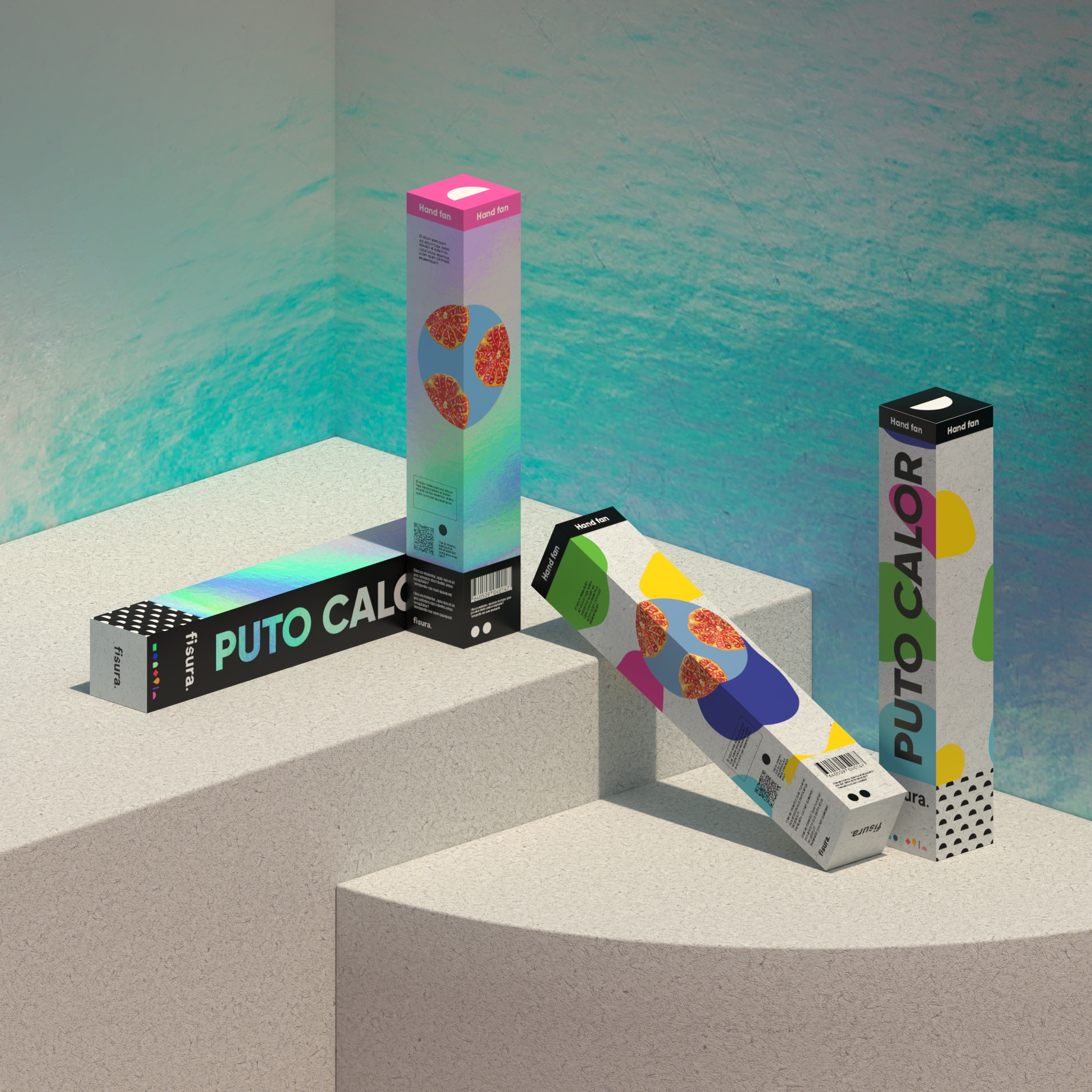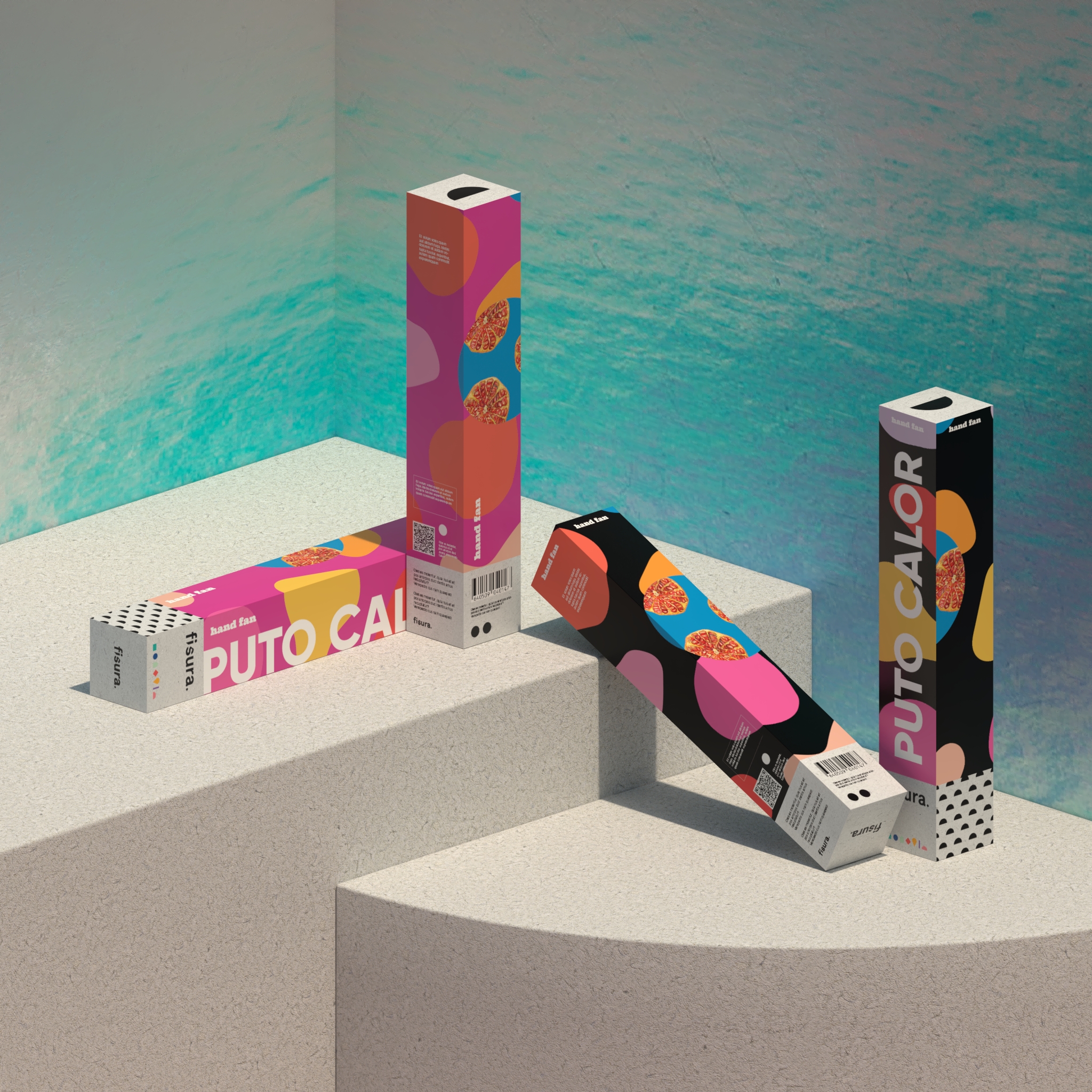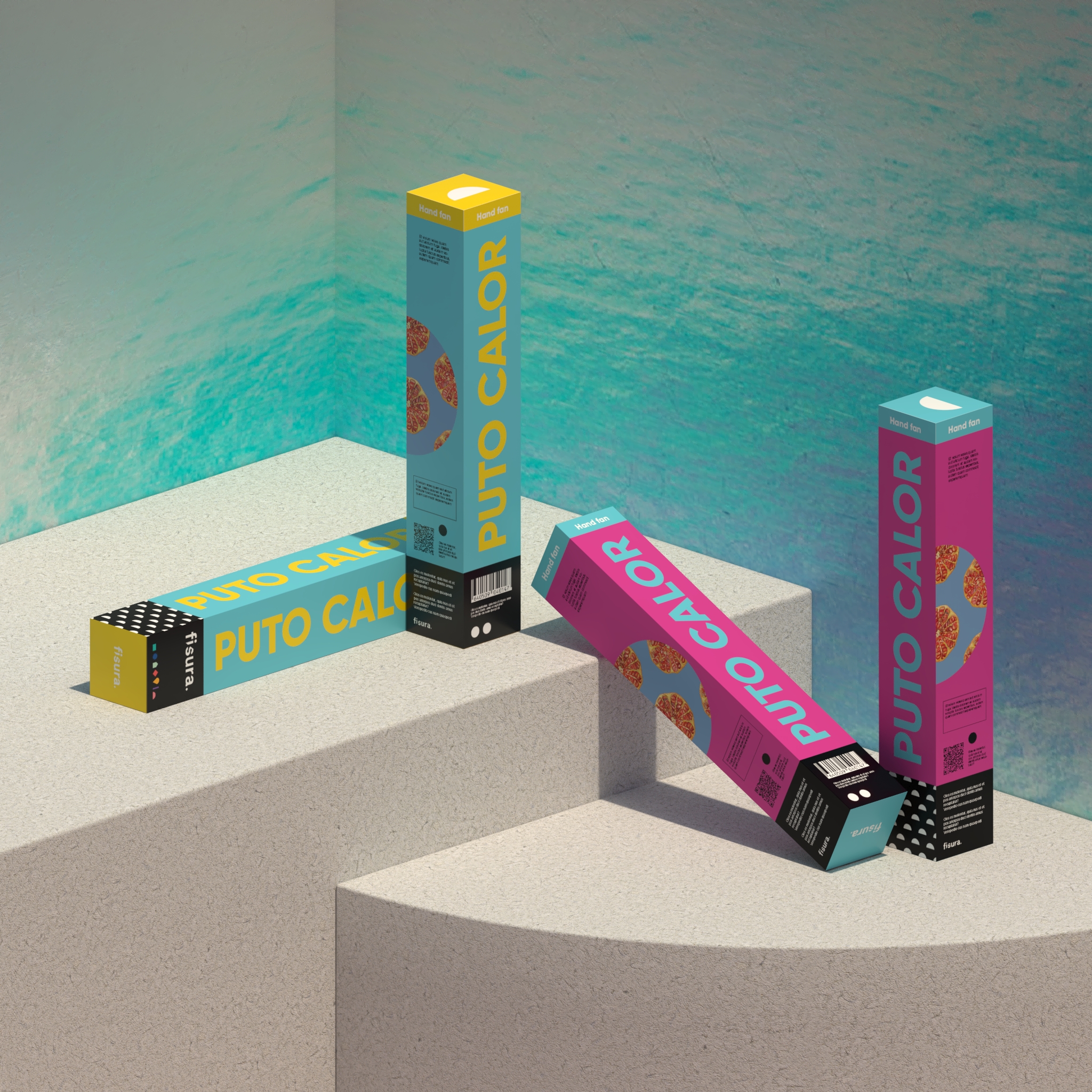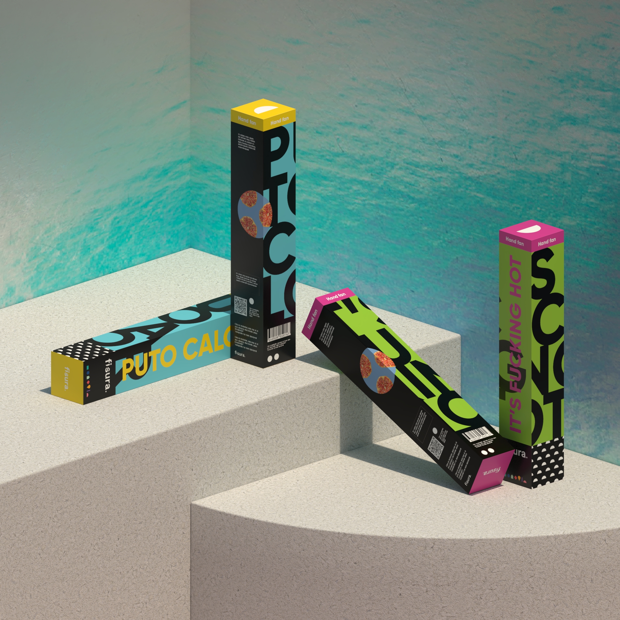
Fisura.
Summer Packaging
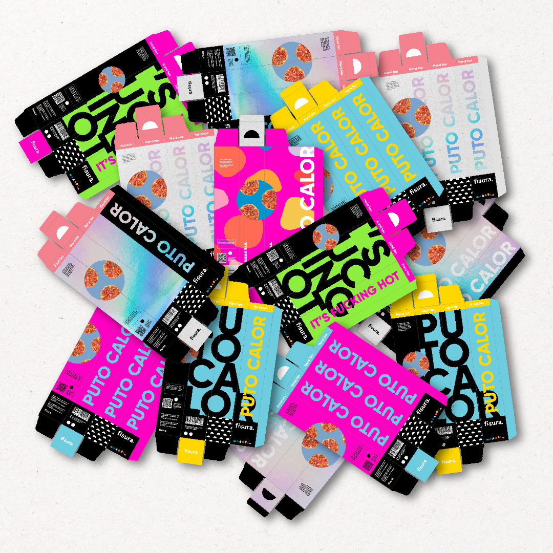
Fisura is a national brand of highly original gift and decoration items with a distinctly irreverent touch. Within its extensive product catalogue, they detected some chaos in terms of packaging, which had grown in a more organic than planned way.
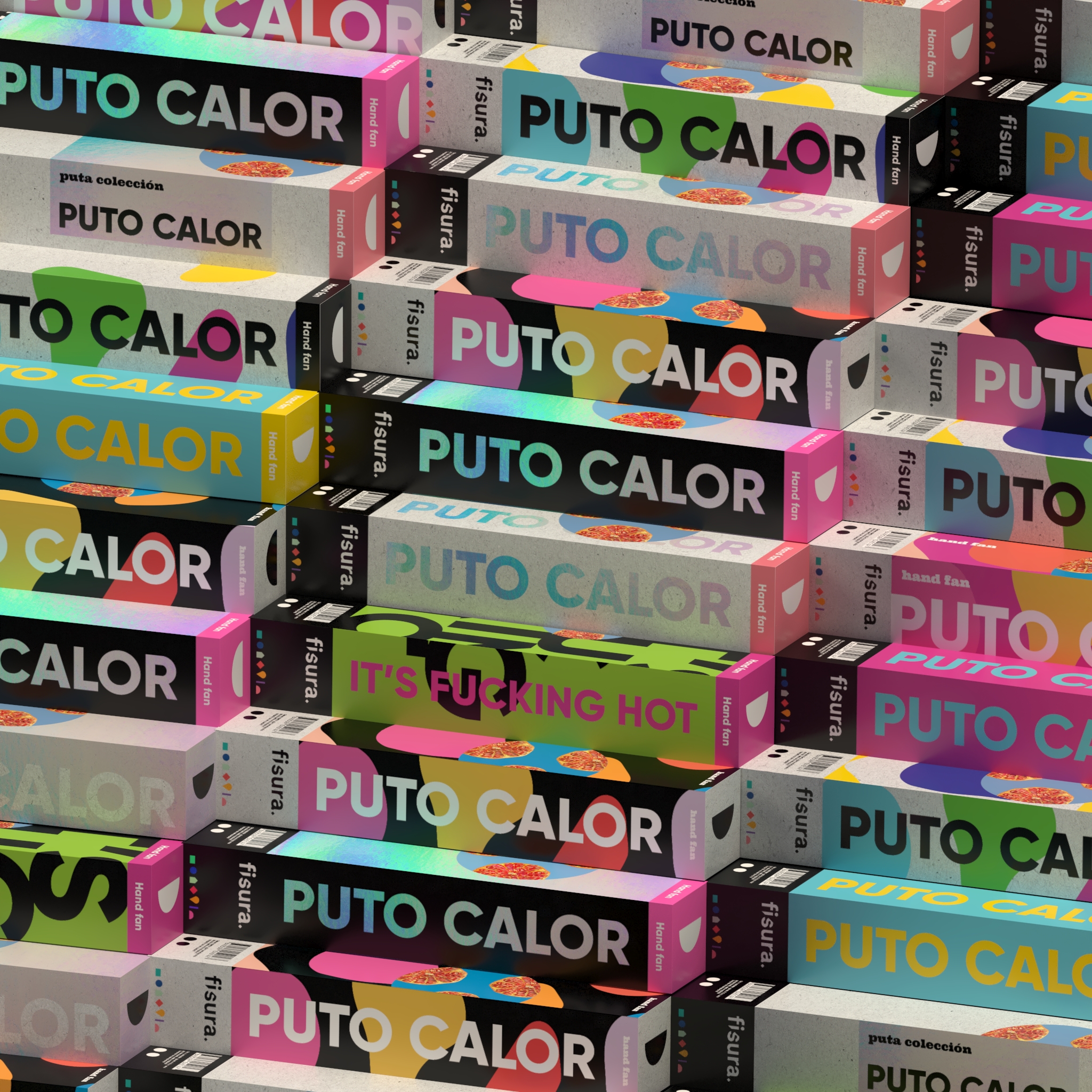
Their main problem was to give their products a certain family feel, unify them in a more coherent way and improve differentiation and legibility in some parts of the packaging when stacking them on shelves and racks, thus making them more visible to shop assistants and consumers when handling them.
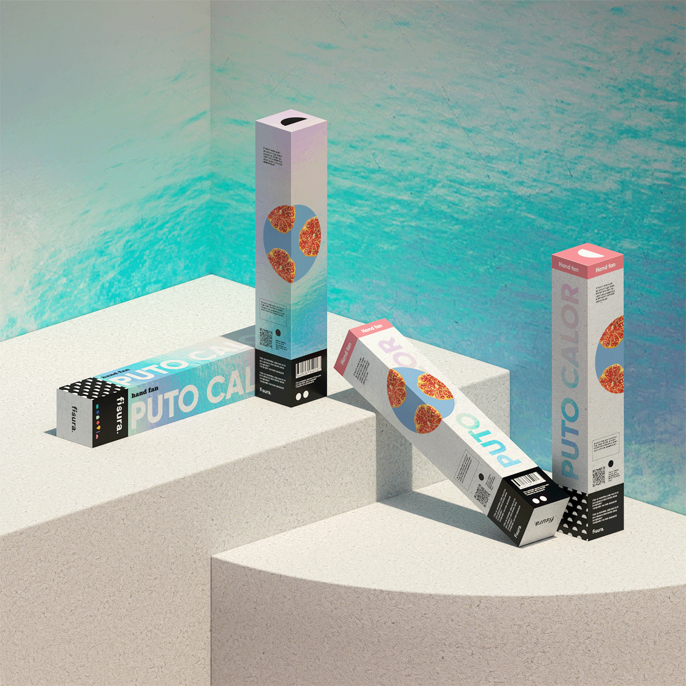
Our proposals maintained their cheerful and colourful character, but unified fonts and created a series of icon bands (one for each product family) supported by a fluorescent colour palette that made them more identifiable among themselves and resulted in designs with a fresh and modern feel.