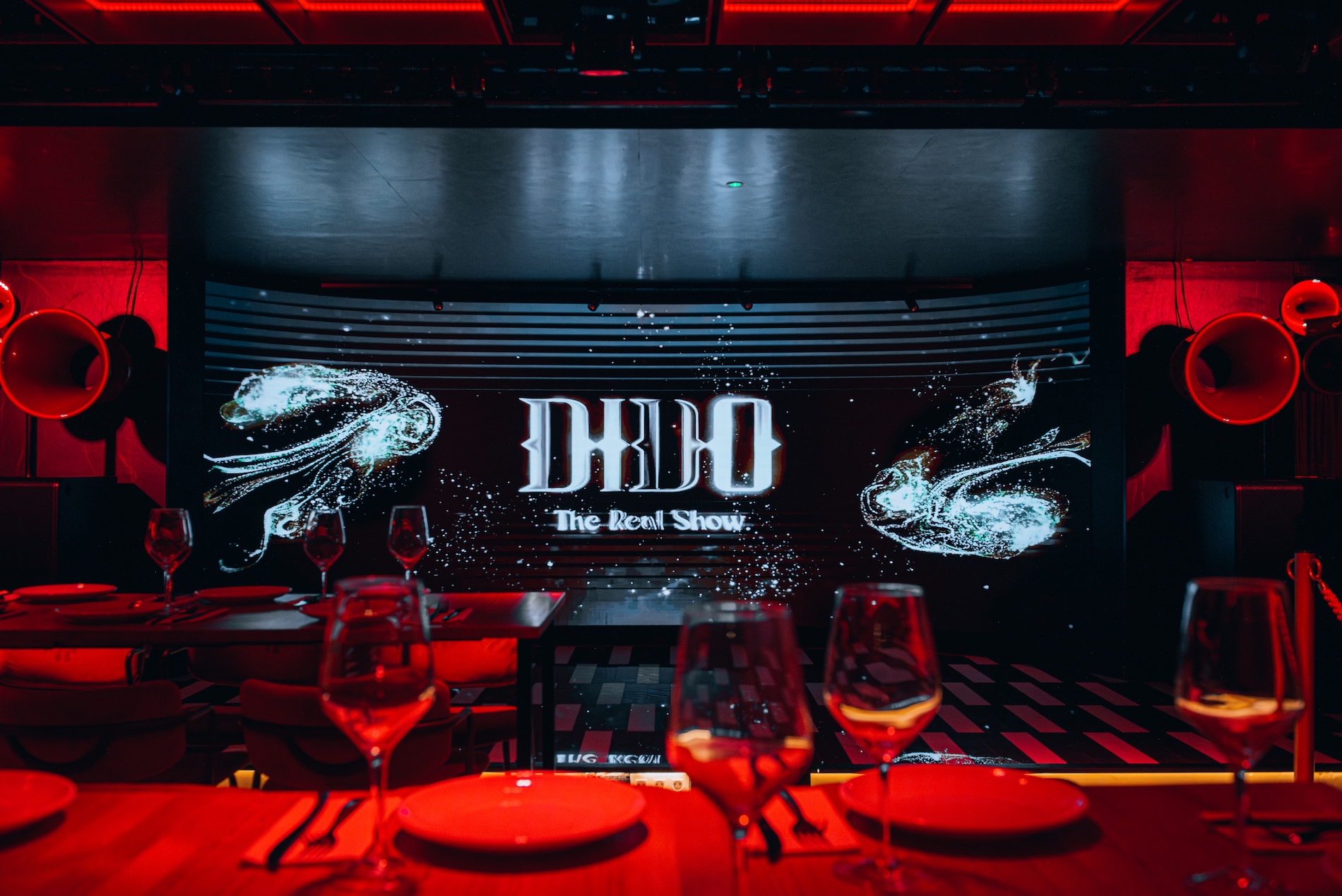
Dido.
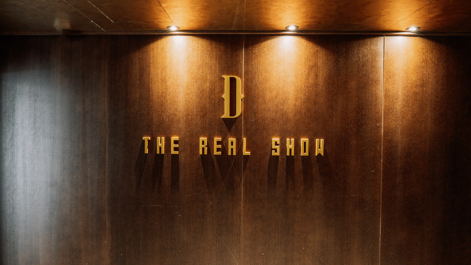
THE REAL SHOW
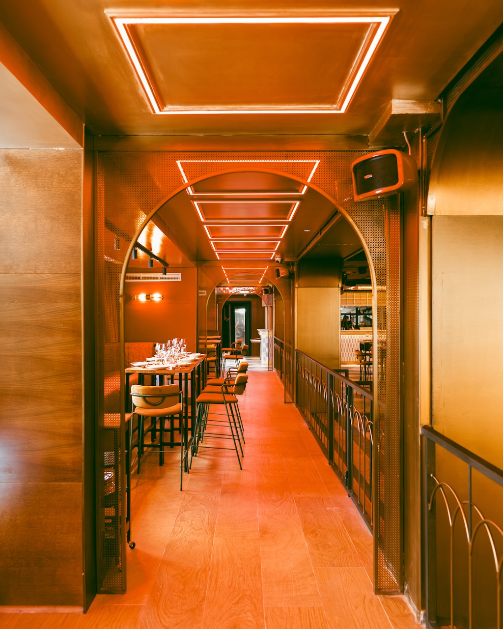
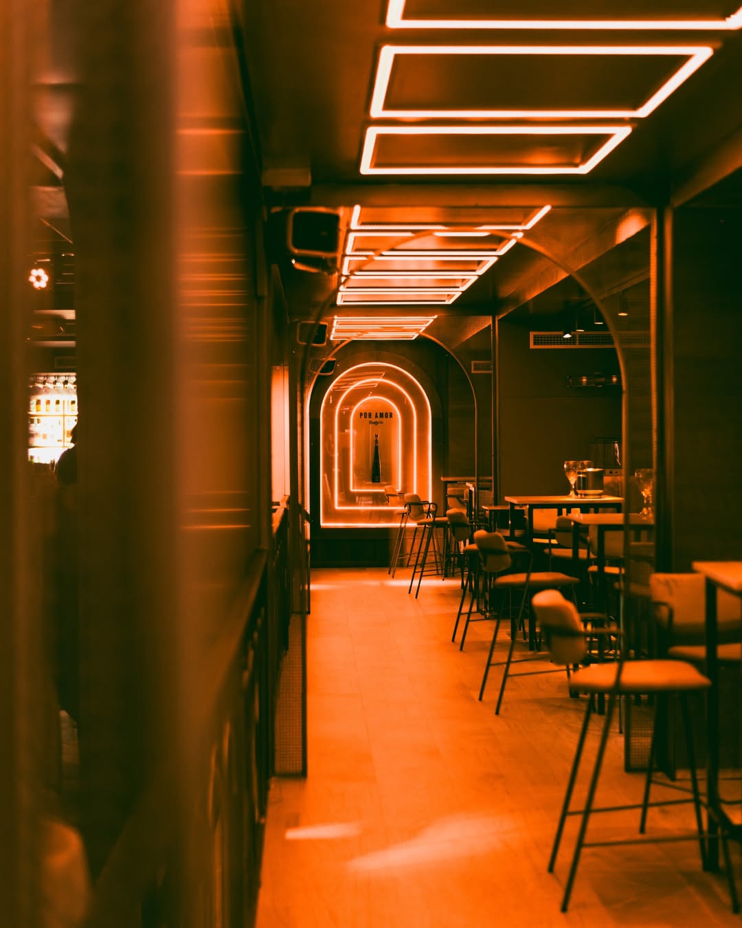
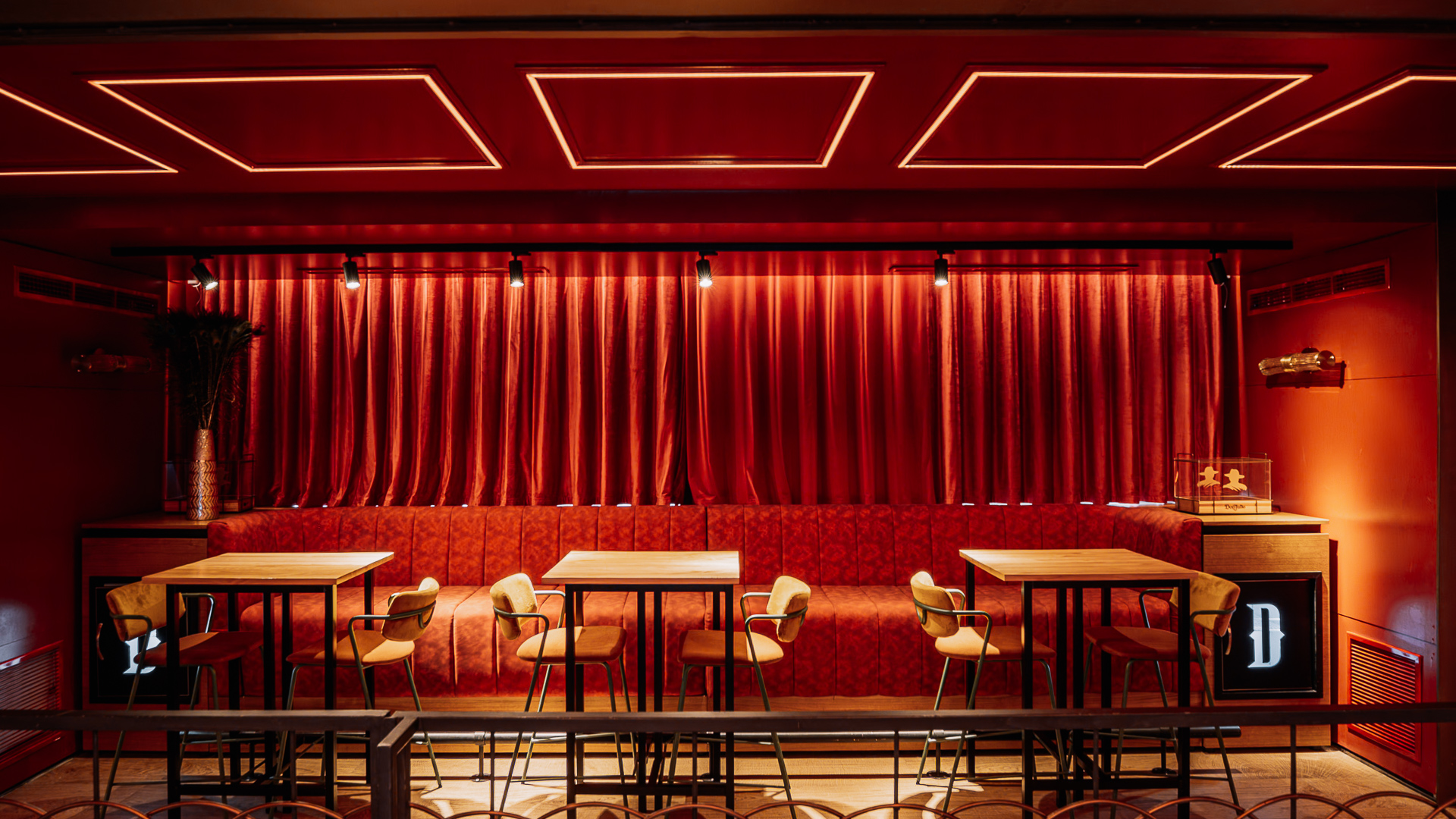
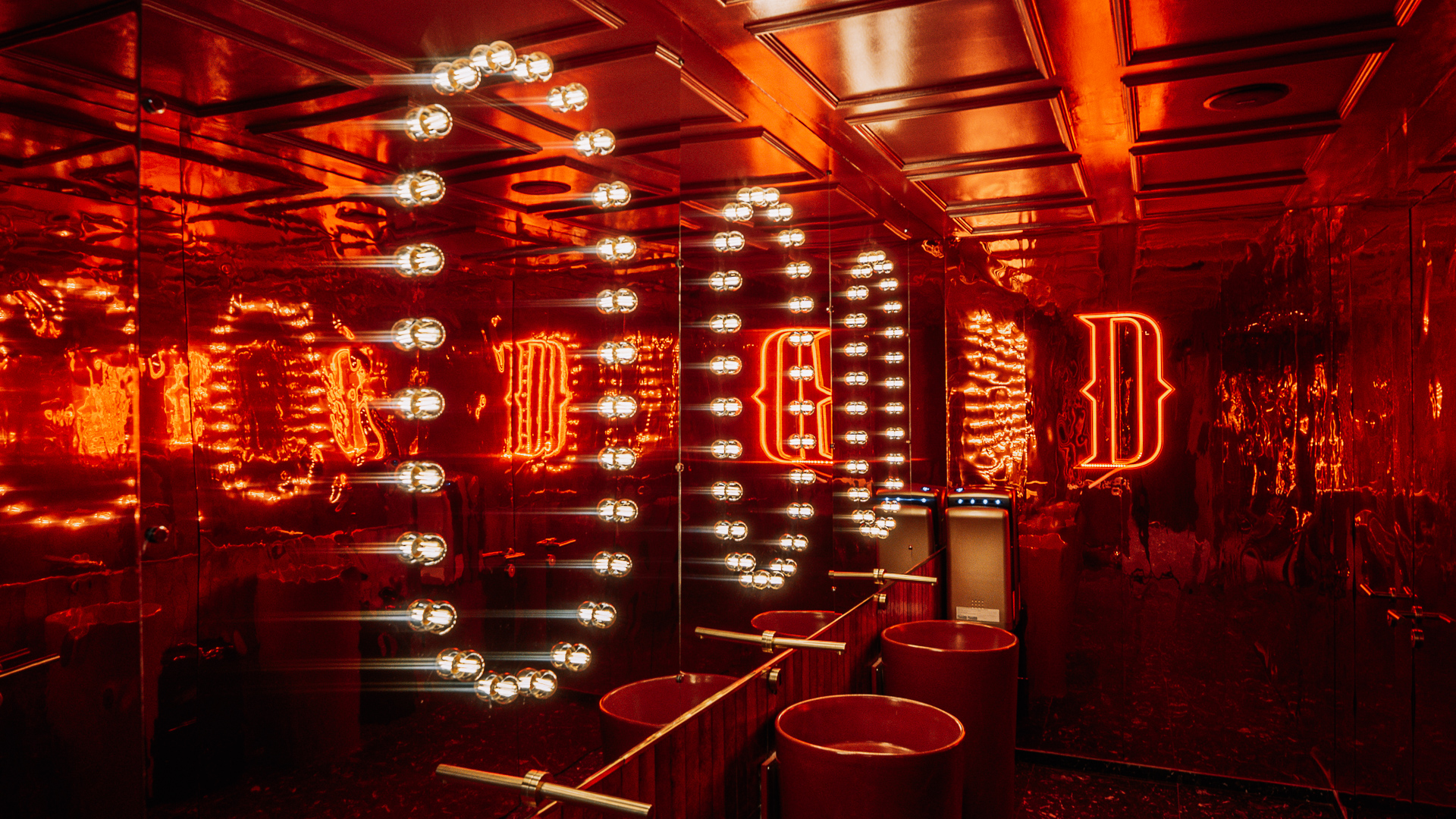
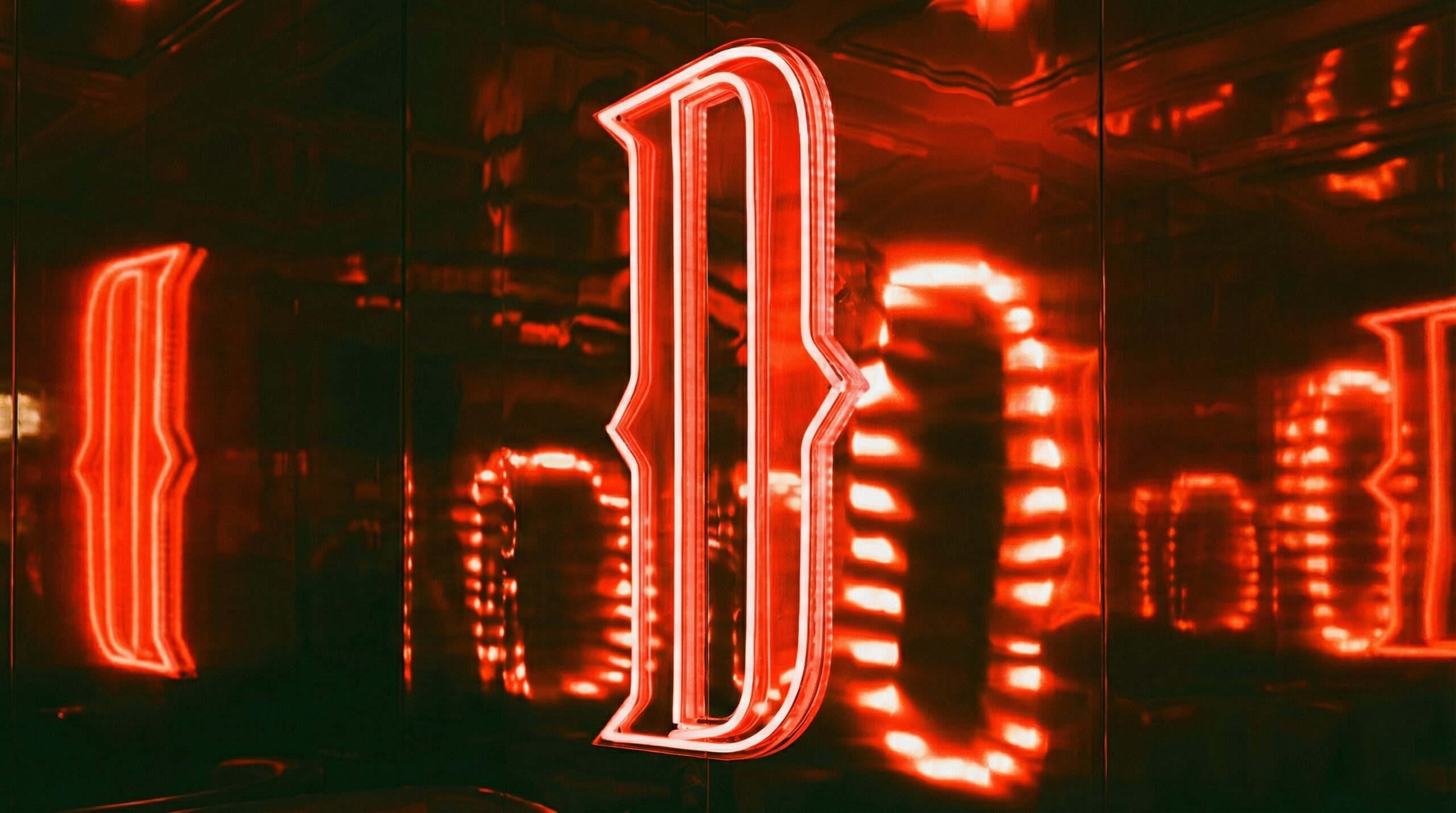
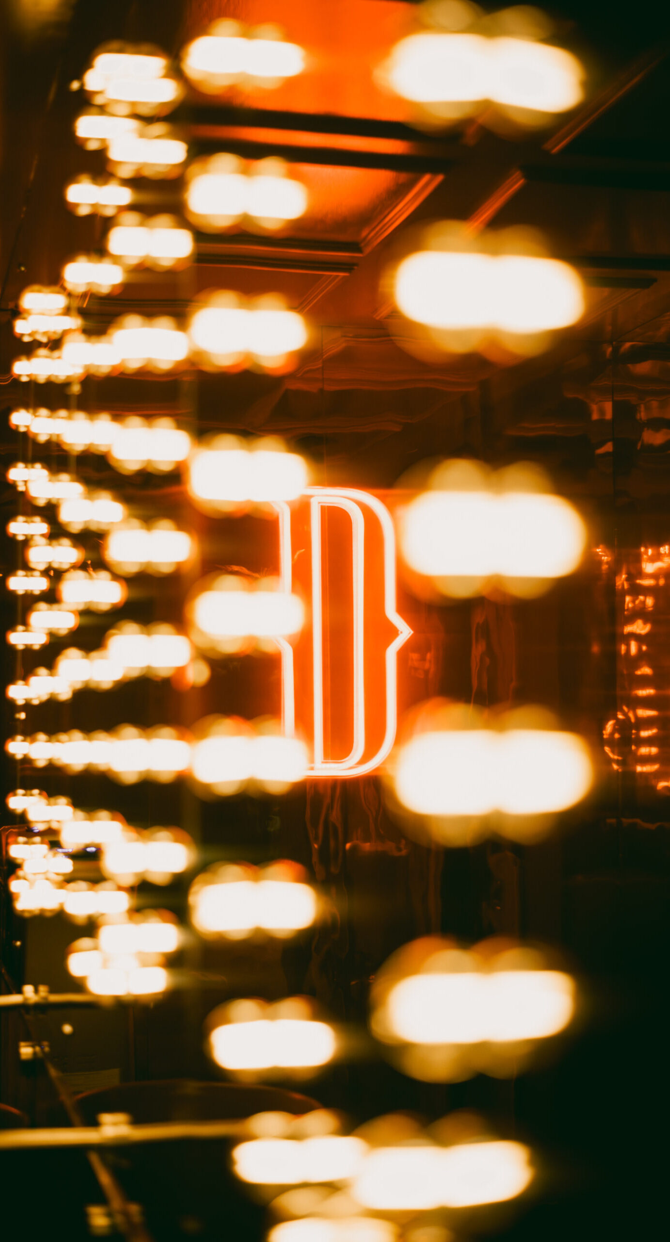
Dido, in English, is synonymous with ‘mischief’, and that is precisely the feeling we wanted to convey. We opted for a colour palette of red and black for a more energetic visual impact, adding the elegance of gold accents.
For the branding, we worked on the typography, emphasising the mischievous, irreverent and playful character of this new venue, whose slogan is ‘The Real Show’.
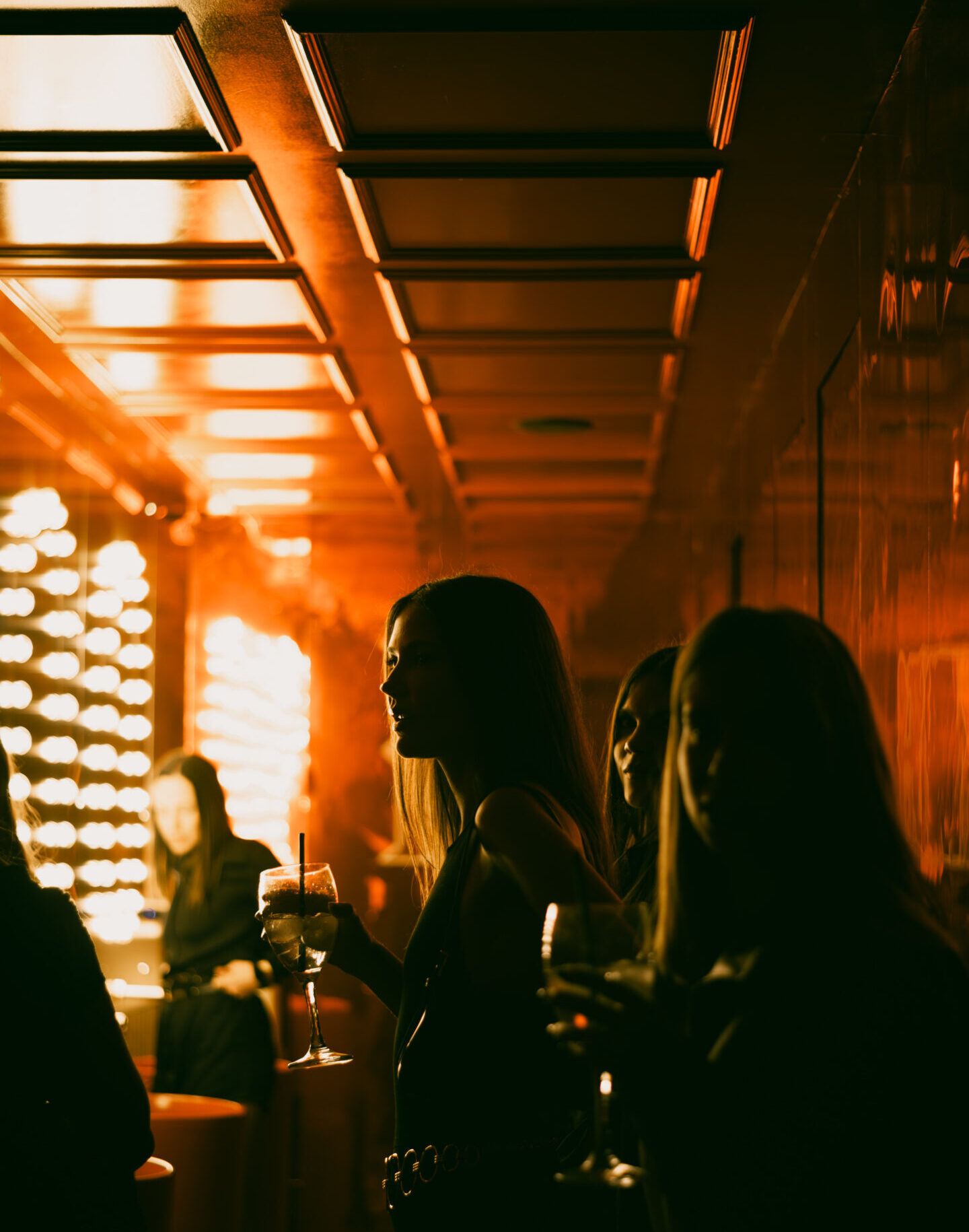
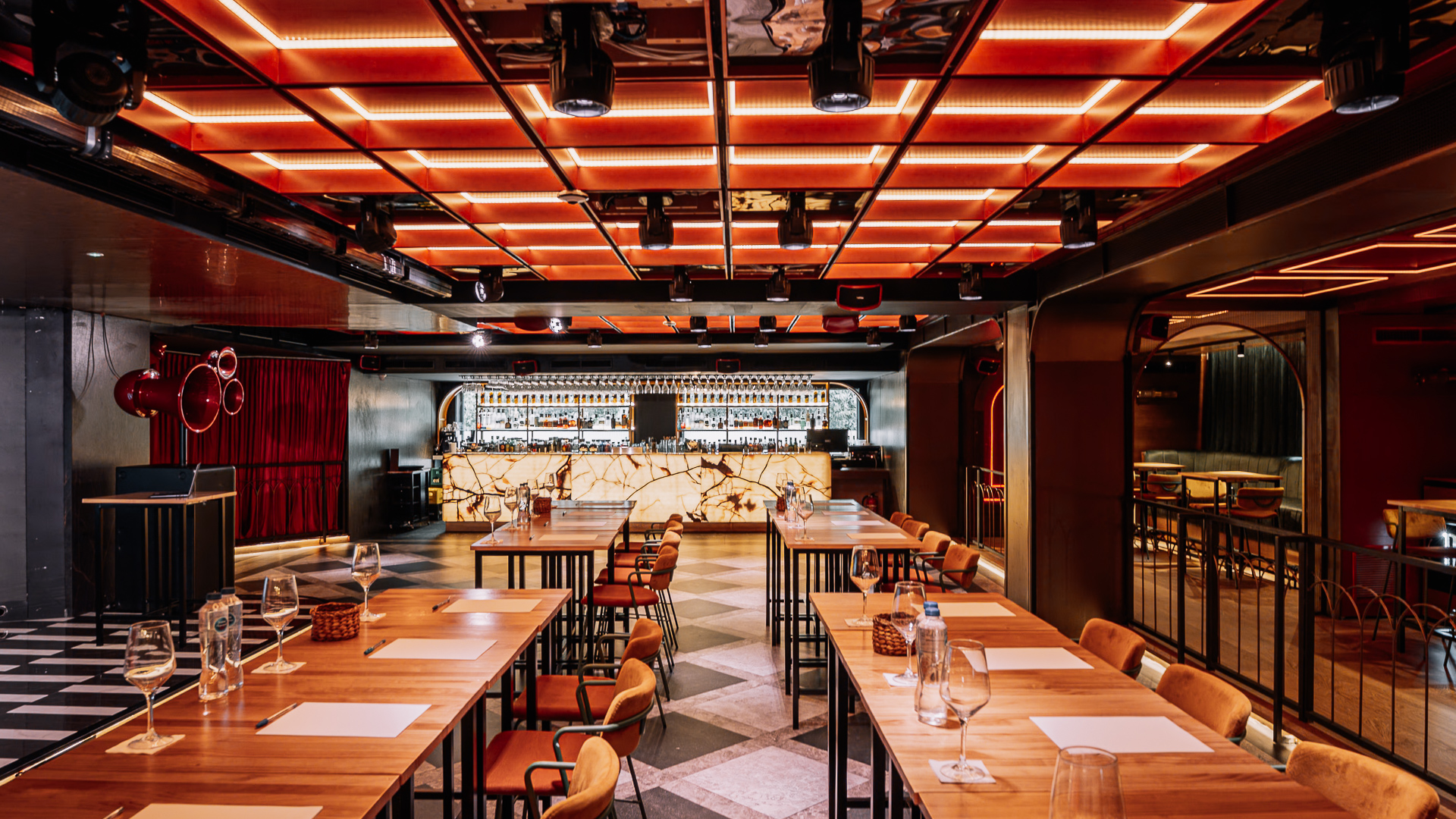
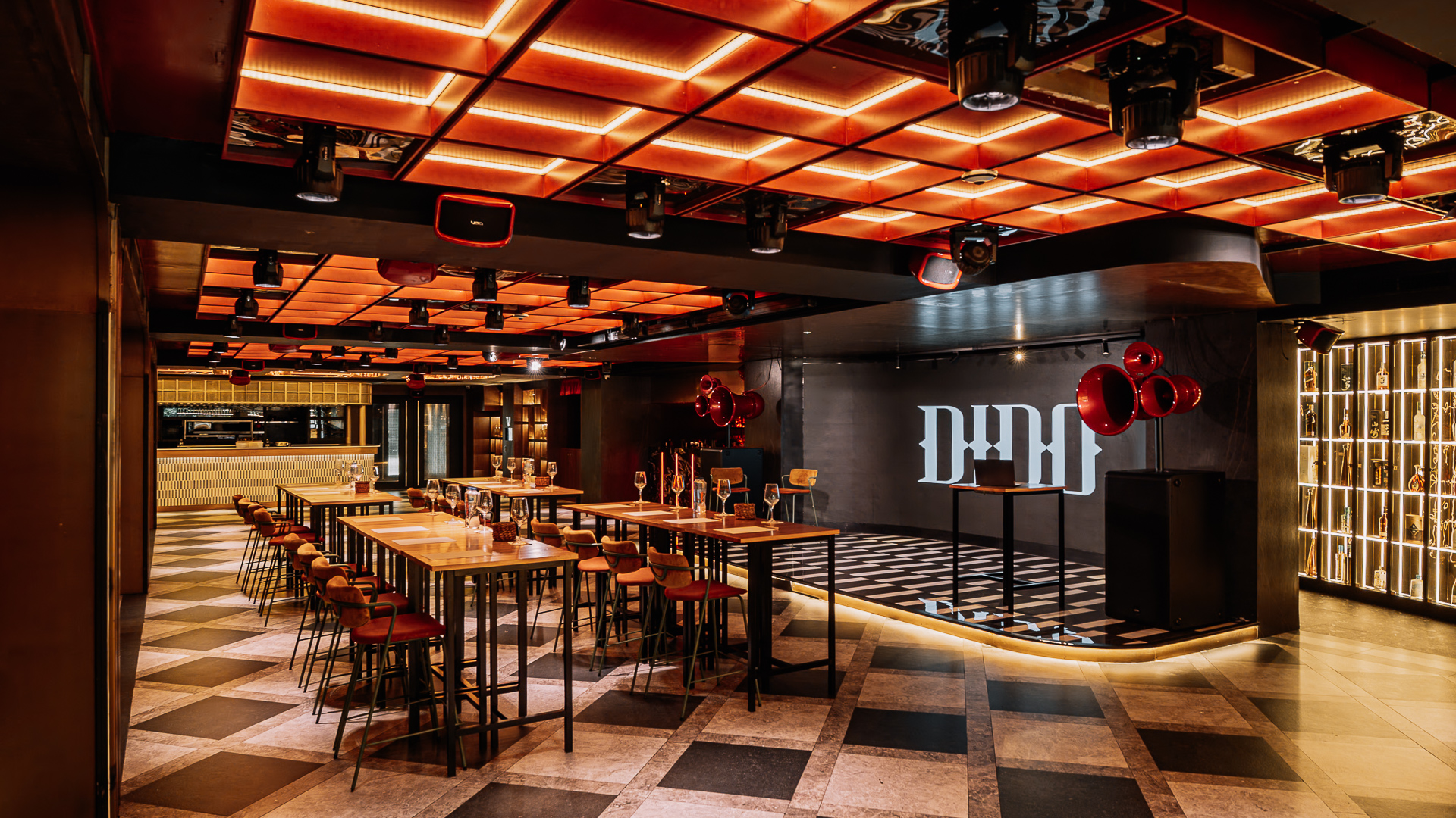
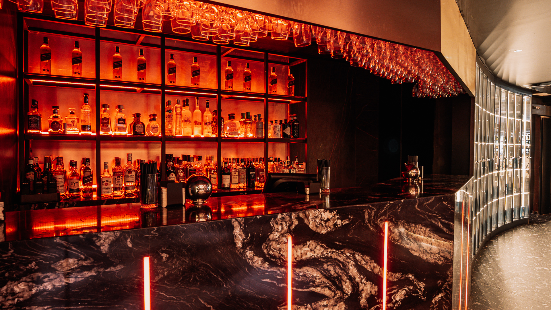
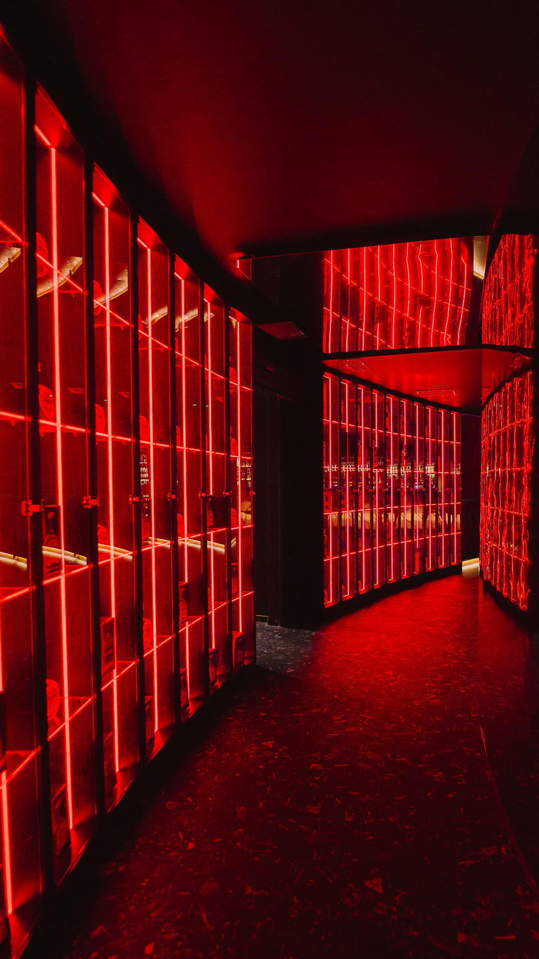
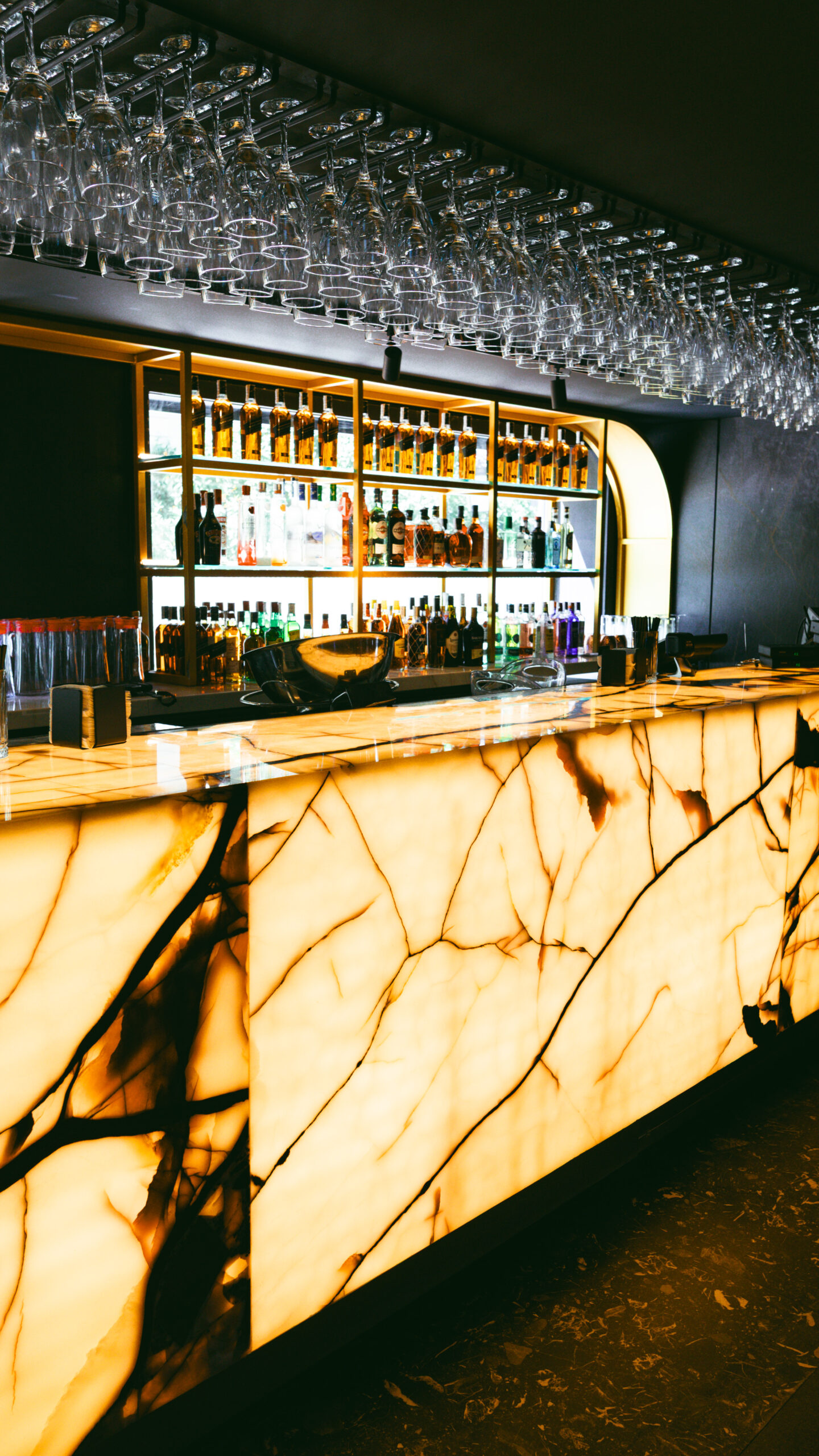
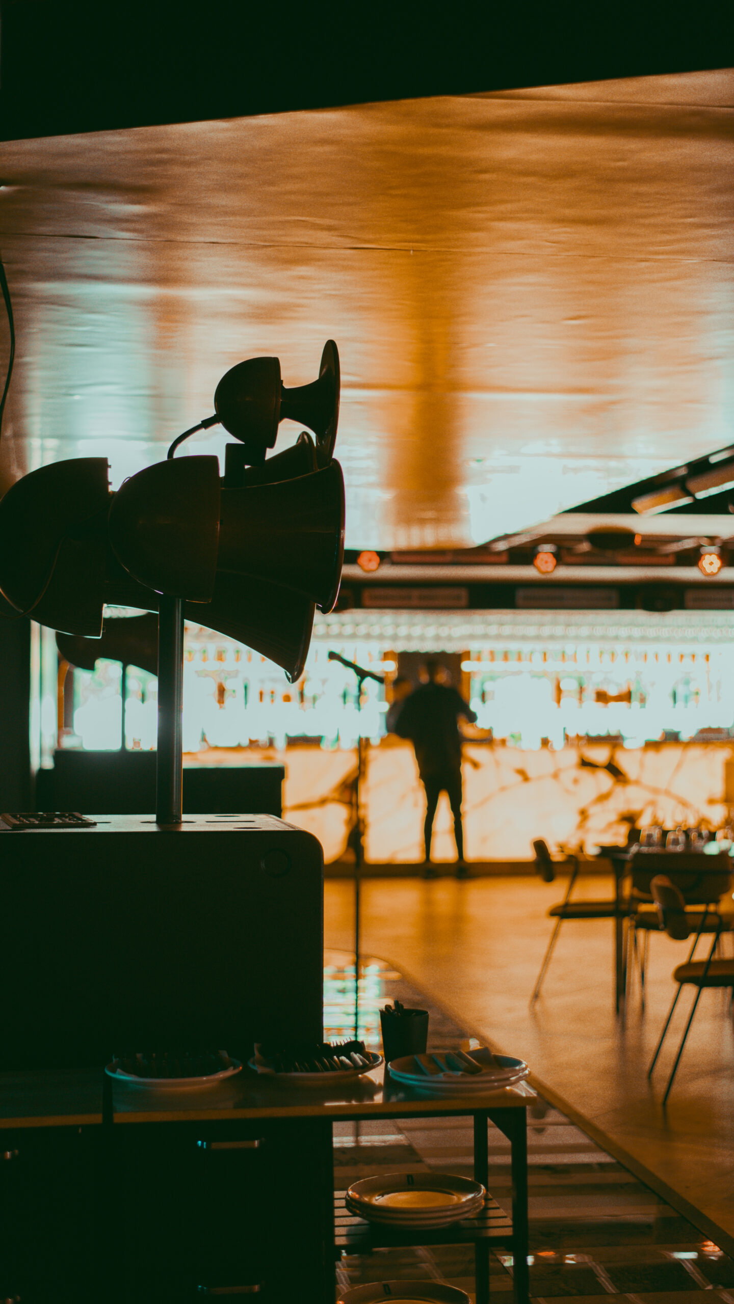
Every corner of Dido is designed for those looking for more than just dinner or a drink. More than a club, it is the perfect refuge where design meets warmth, lights, textures and rhythm. Playing with contrast: from the softness of velvet in our private rooms to the electric pulse of the neon lights that light the way.
Our visual proposal is clear: total immersion in colour. Using linear shapes to create a depth that envelops you from the moment you walk through the door.
The result is like the venue’s personality itself, playful and vibrant, like the gastronomic offering combined with live shows, which seeks to provide a totally immersive experience for visitors.