Pitimini.
A nod to the traditional
Opening a tavern without falling into fleeting trends is no easy task. But at Pitiminï, they were clear from the start: they aren’t about trends—they’re about traditions.
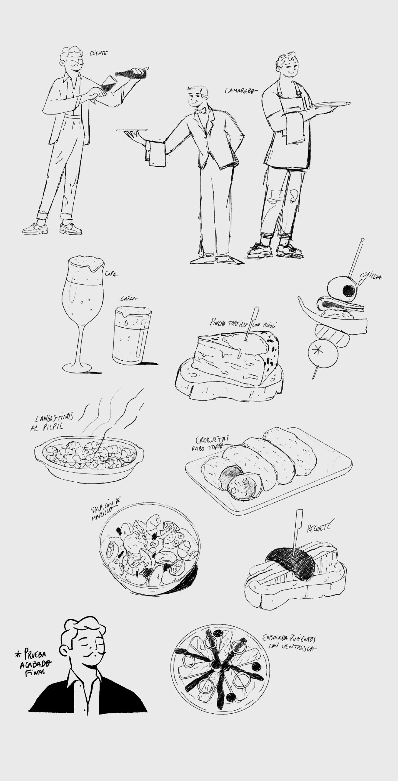
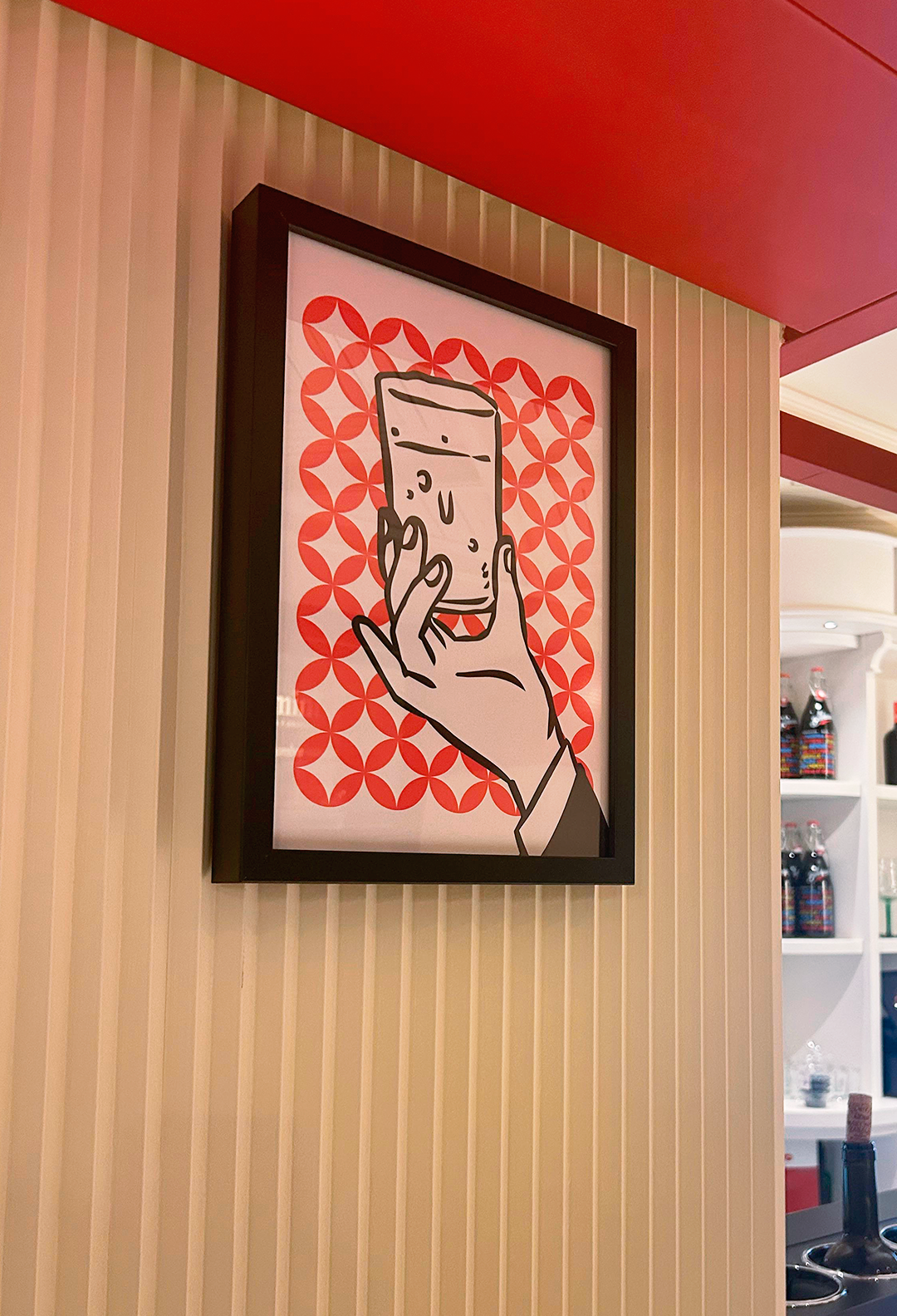
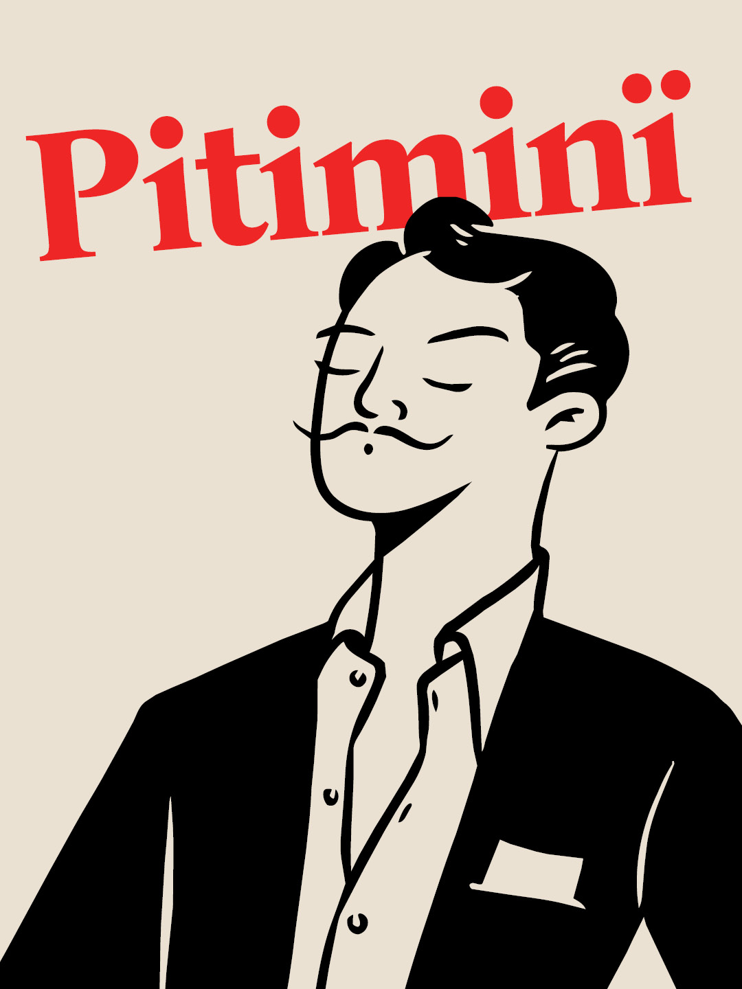
They also have a great sense of humor. Their core concept was to pay homage to traditional taverns and their regular clientele, while adapting the experience for the modern day with a contemporary, highly distinctive aesthetic. Everything revolves around a central character, Don Pitiminï—a classic “gentleman” reimagined for the 21st century. He enjoys an ice-cold beer paired with traditional tapas, yet remains open to new culinary surprises. Gildas (skewered snacks), tortilla de patatas (Spanish potato omelet), fried delicacies… There’s no need to reinvent the wheel—you just have to make sure the spark stays alive.
While there are plenty of taverns that serve beer with a tapa, very few have made ice-cold beer their true raison d’être. Even fewer have managed to blend a classic style with an appeal that resonates across different generations.
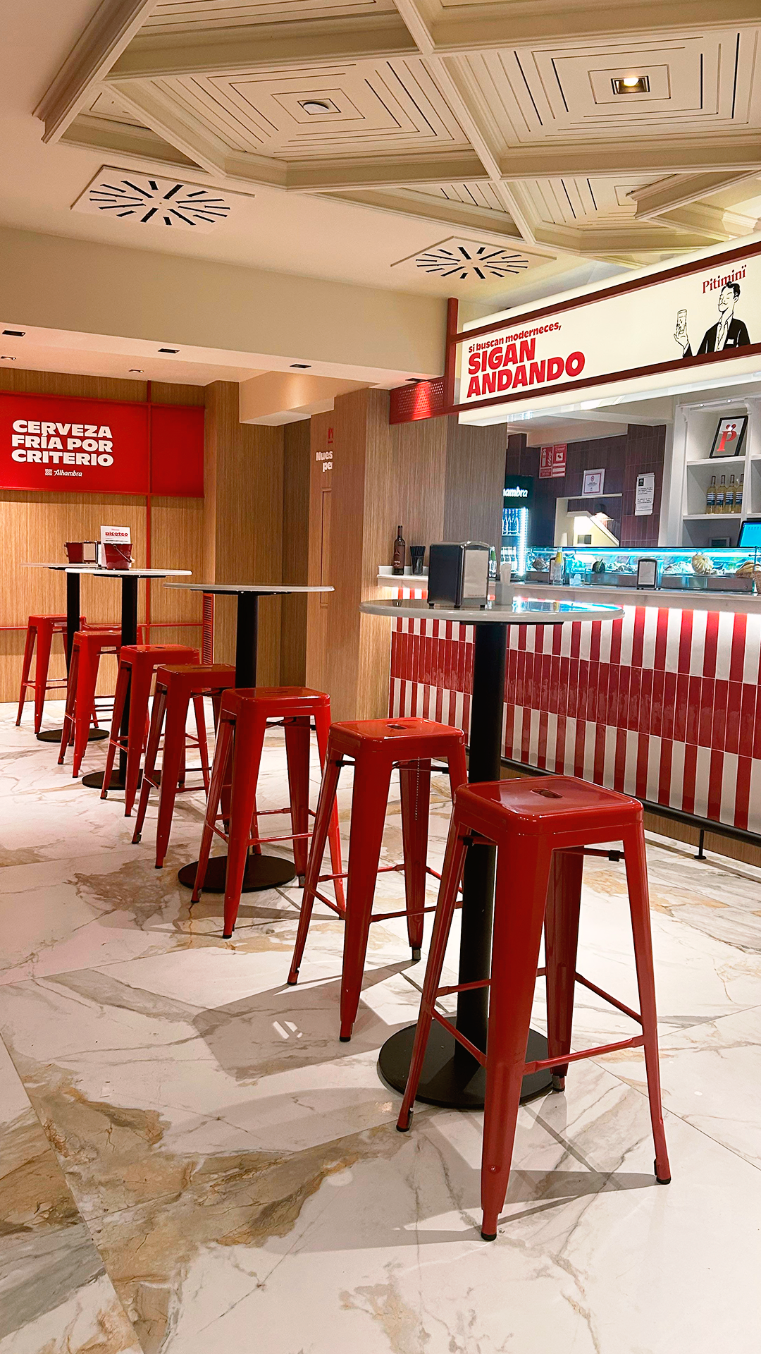
For this reason, the venue’s personality draws on retro elements and classic design schemes—utilizing color palettes typical of advertising from that era—much like the new wave of beer brands looking to reclaim a traditional flavor.

Classy, ‘Granaina’ style tavern
In Granada, competition in this sector is cutthroat. You either stand out for the right reasons, or you vanish. You need a crystal-clear concept, backed by an equally clear and impactful visual identity.
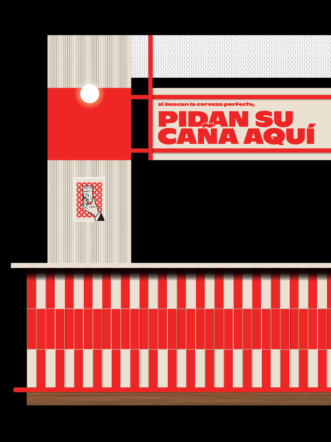
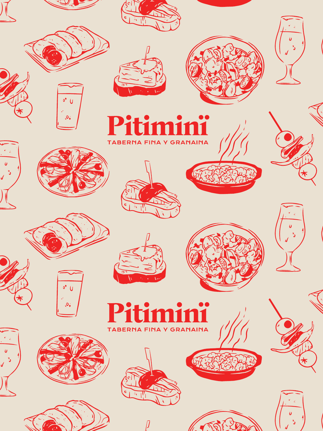
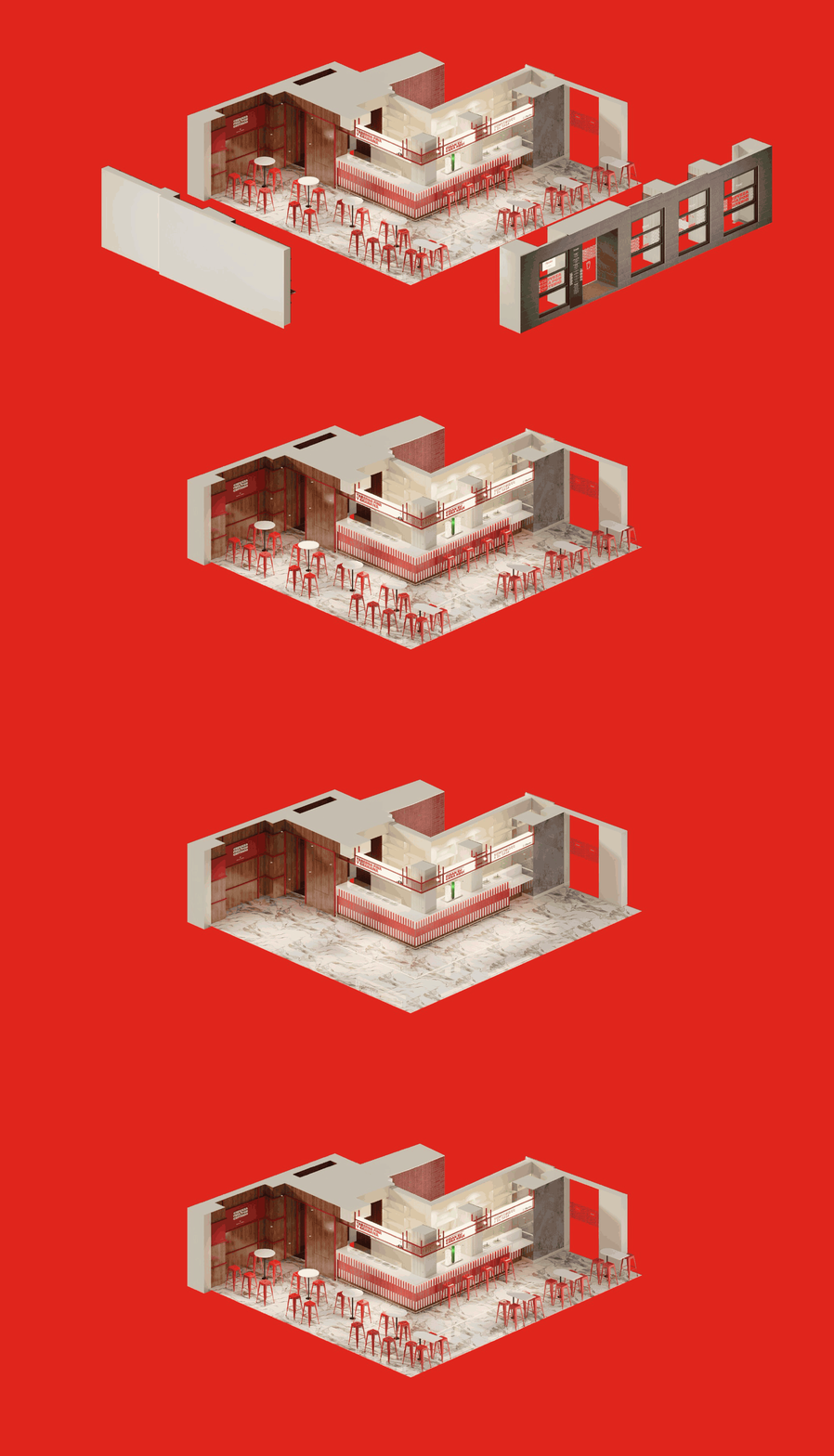
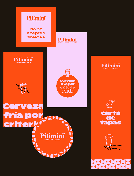
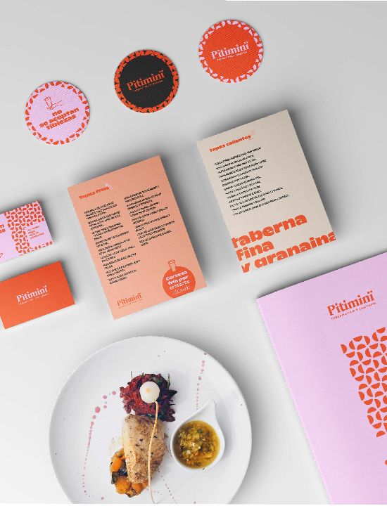
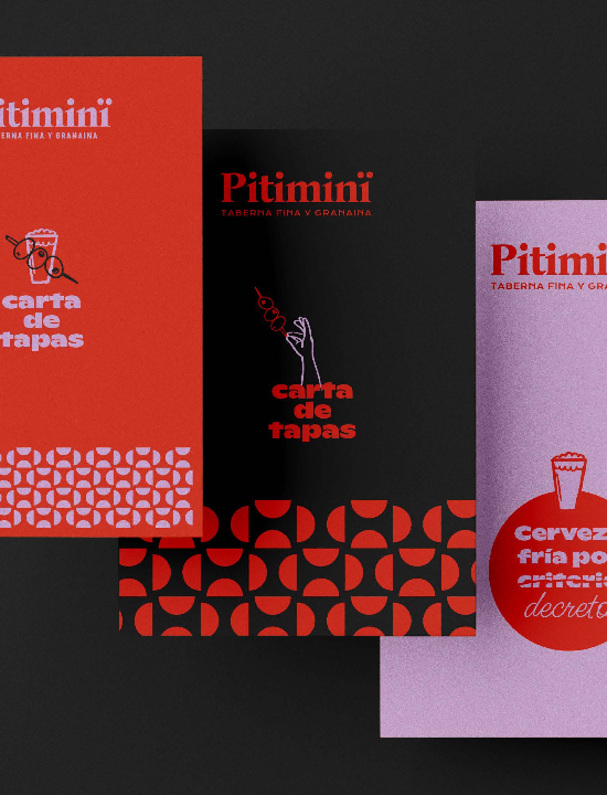
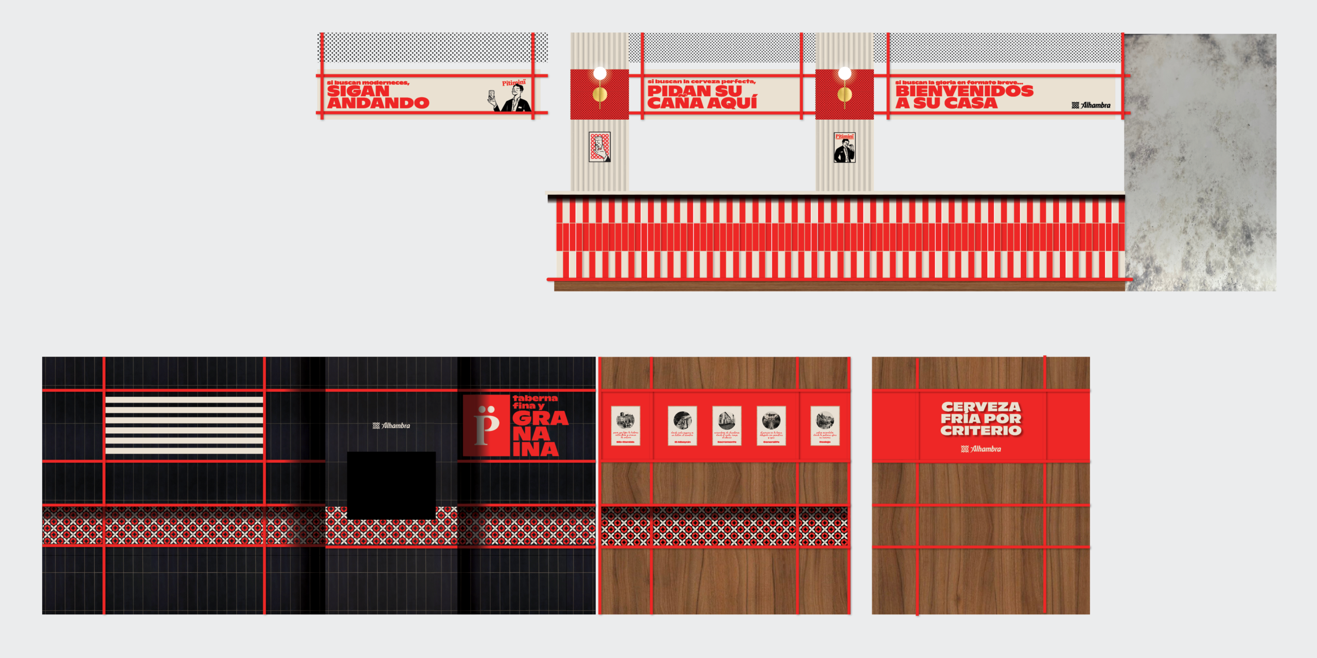
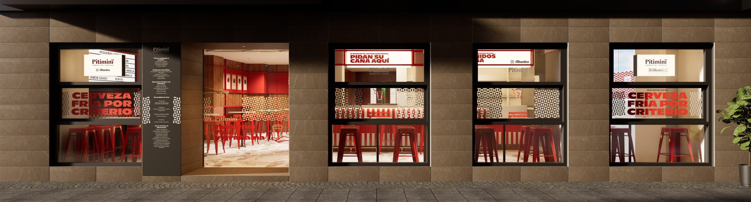
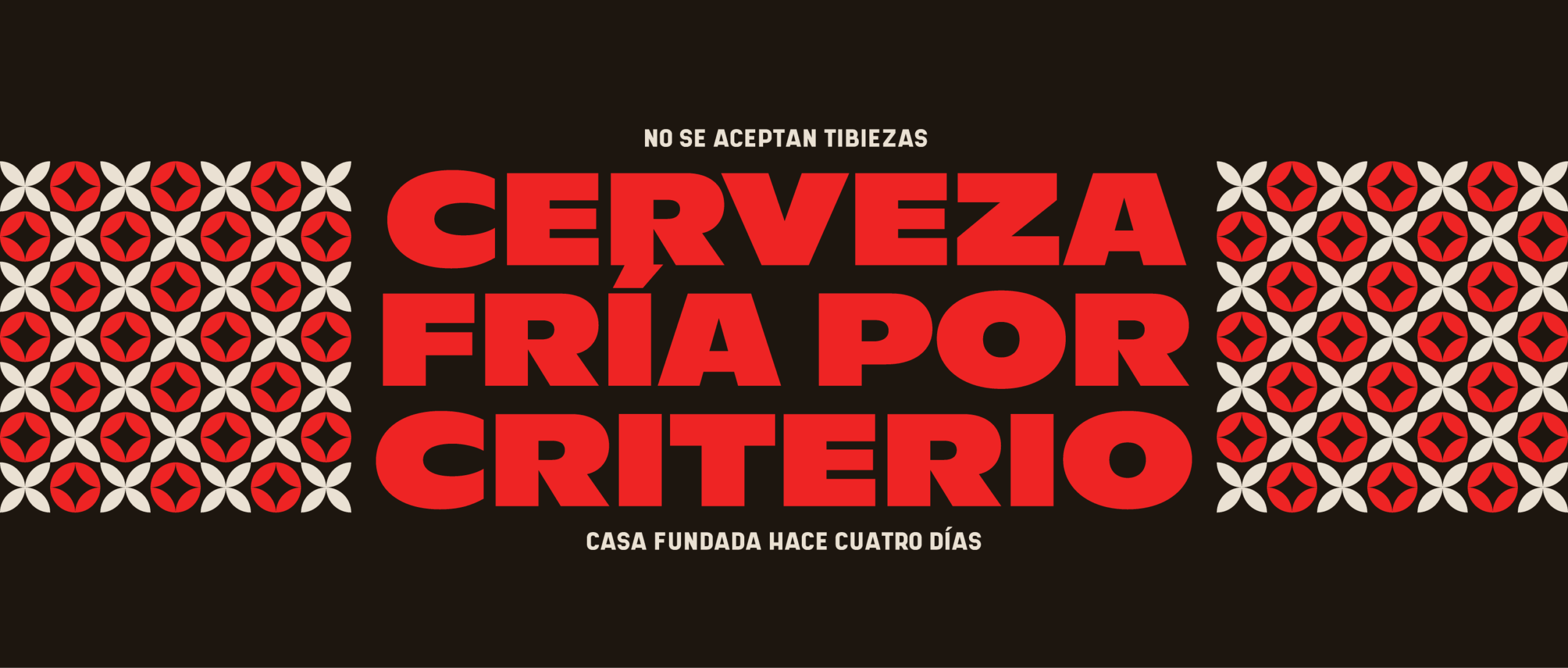
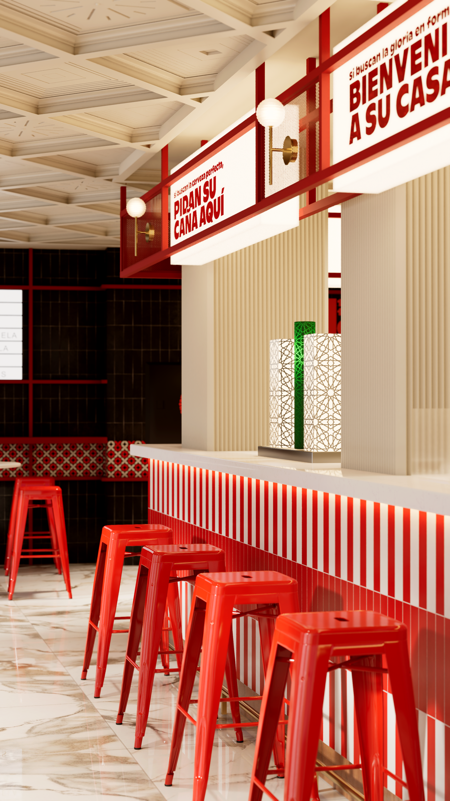
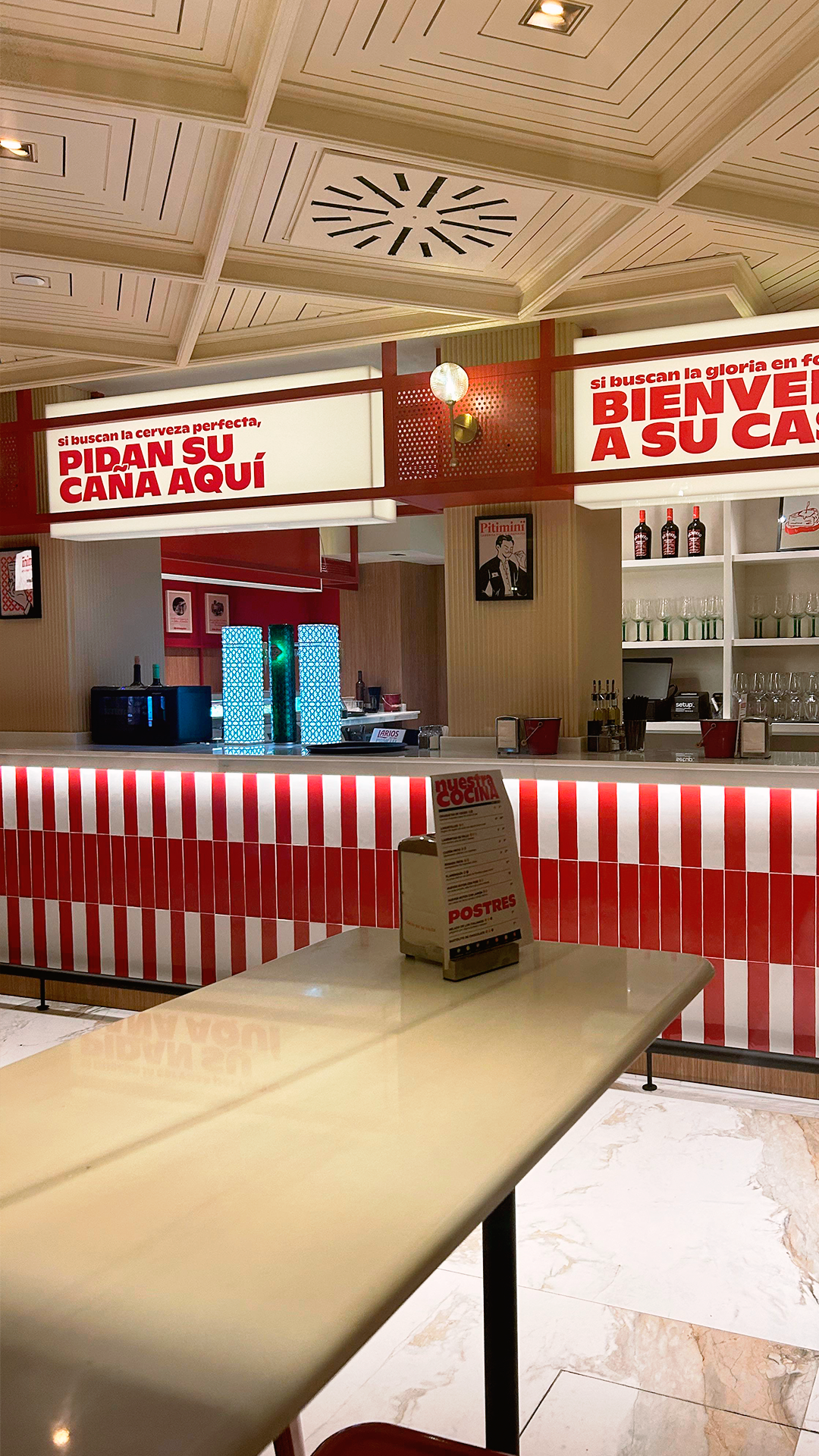
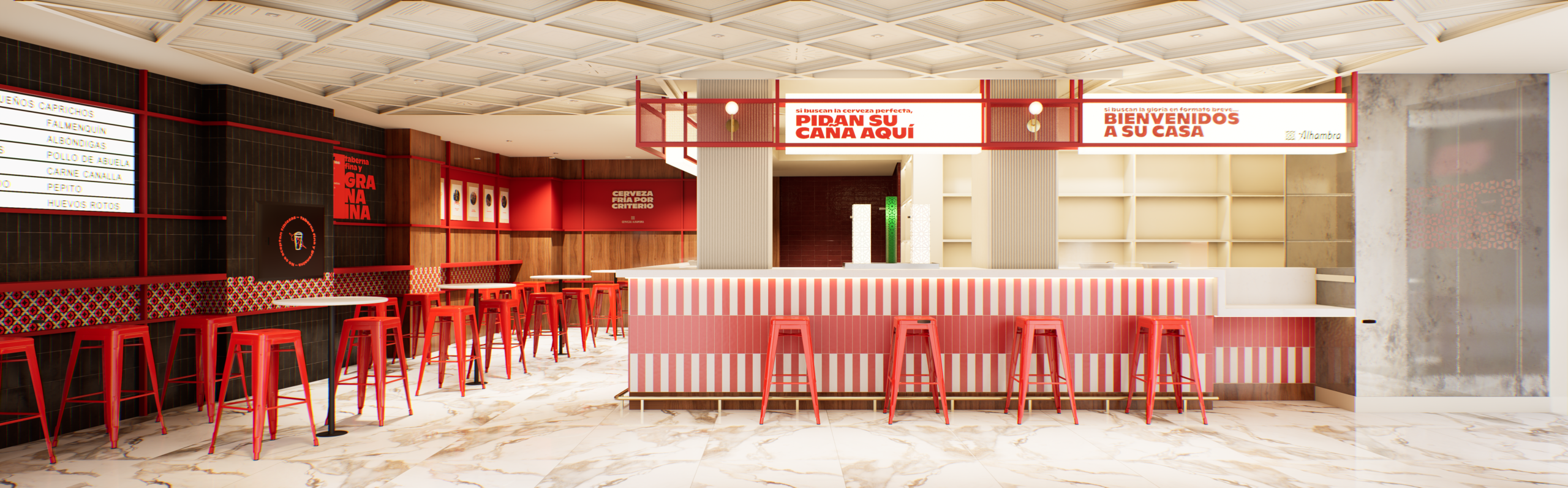
We began experimenting with graphics inspired by tile patterns, using a color palette limited to bright red, black, and cream. We also introduced a character—Don Pitiminï—created by one of our favorite illustrators and designers, Pablo Valverde. He went on to develop an entire suite of tapa-themed graphic elements to complement the overall visual system. The chosen location was the former reception area of a centrally located hotel, which left us with little room to maneuver—we were asked to keep structural changes to an absolute minimum. Rather than viewing this as a limitation, we embraced it as a challenge, focusing our efforts on key strategic areas that would anchor the entire interior: the bar, the left-hand wall, and the storefront. By incorporating touches of the brand’s signature red, gold accents, tiled surfaces, wood, and signage and graphics reminiscent of a traditional market, we created a vibrant space that still retains an authentic, local character.