Yoga Salud.
Space, Body and Mind
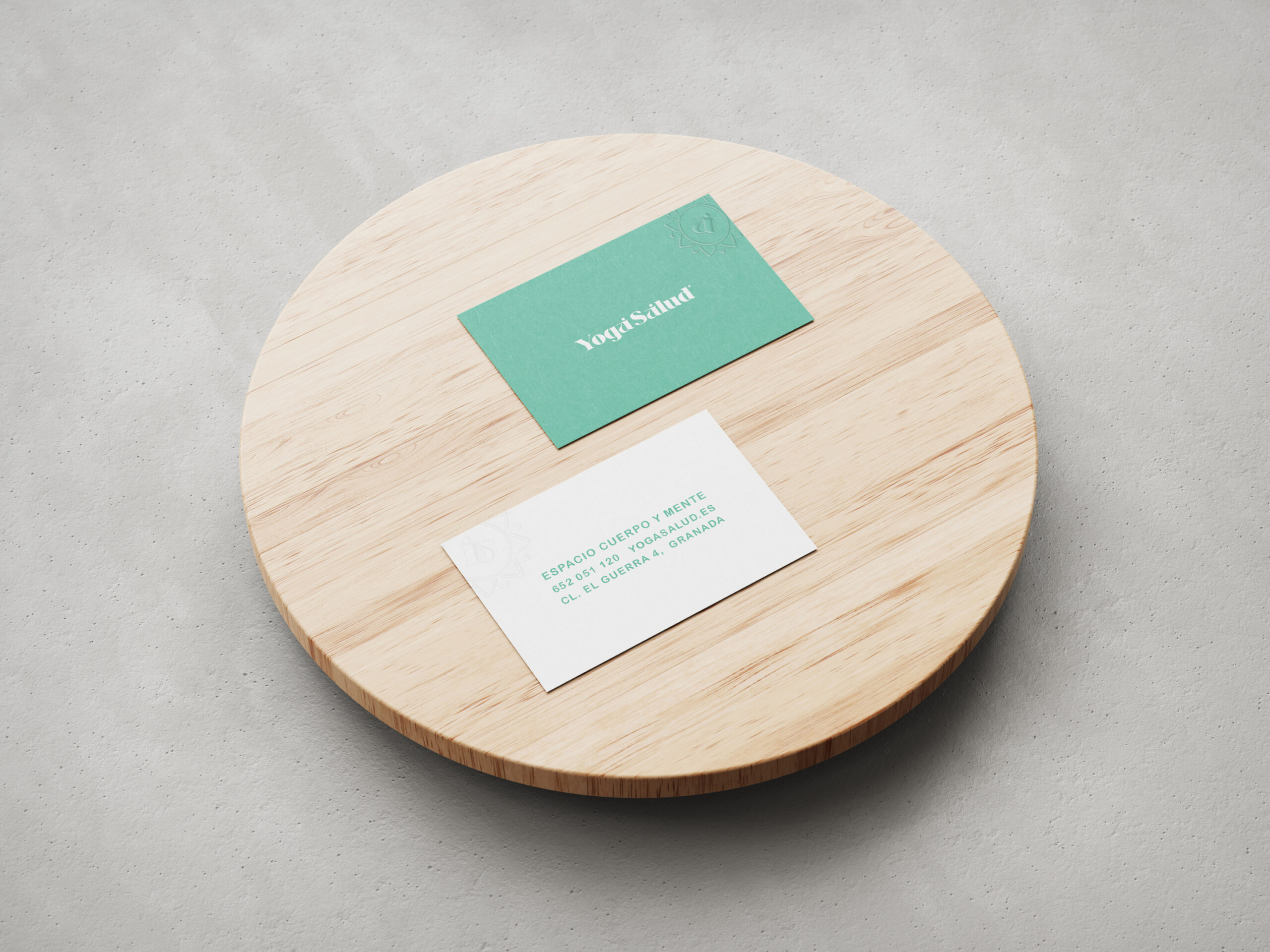
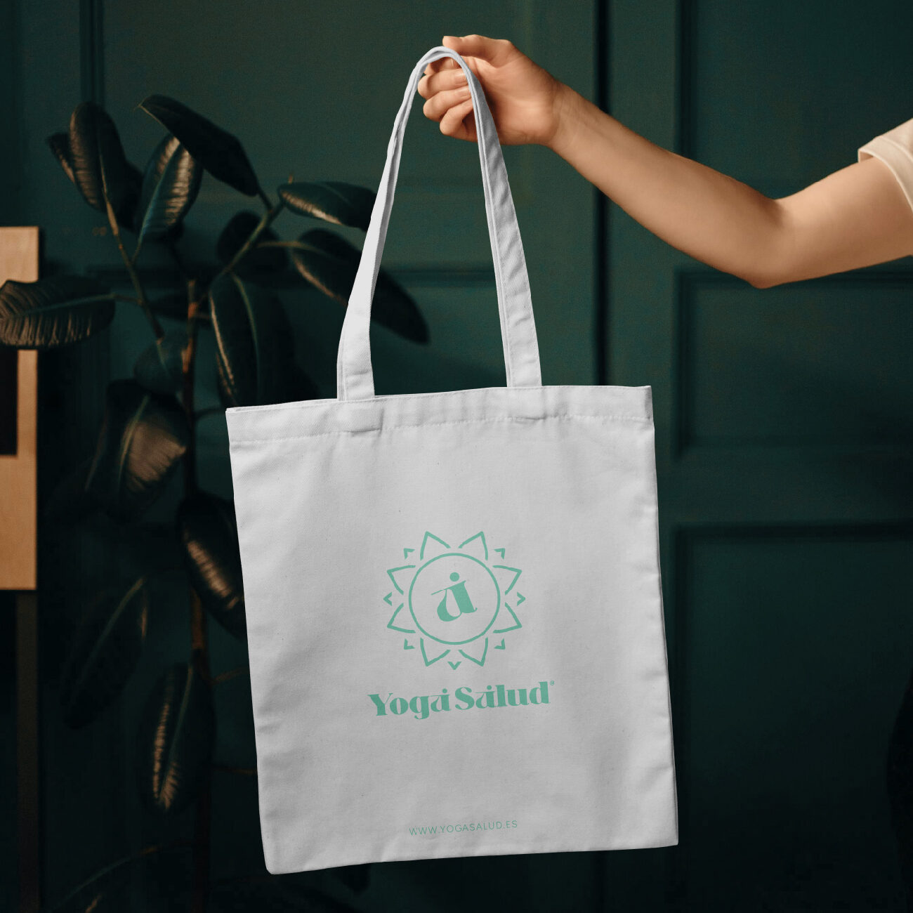
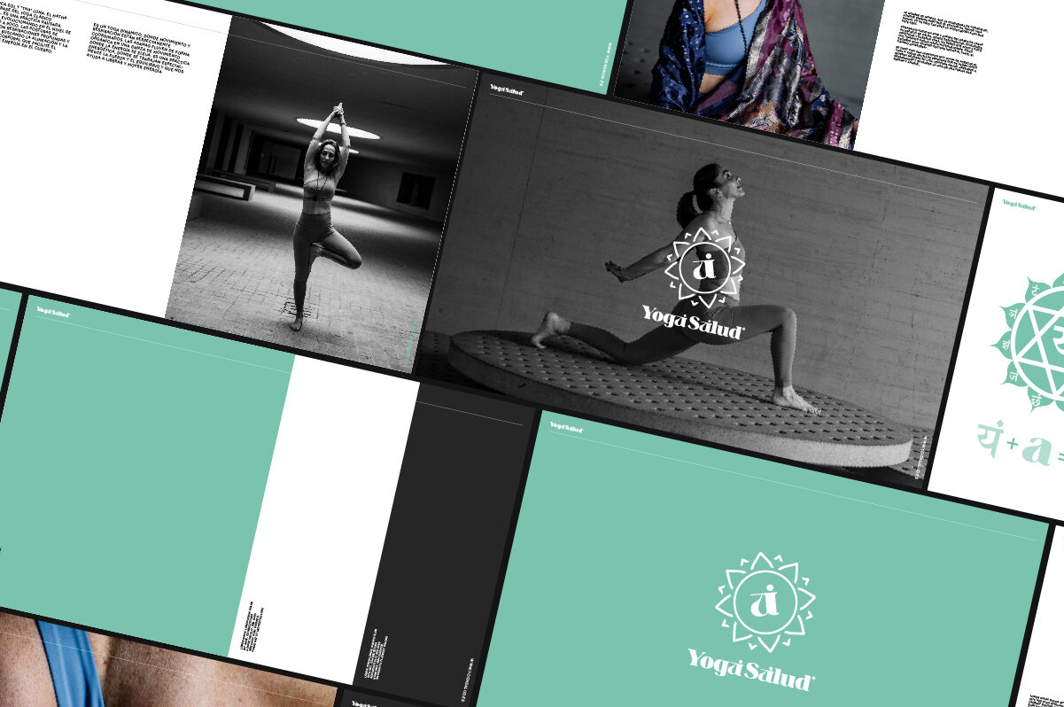
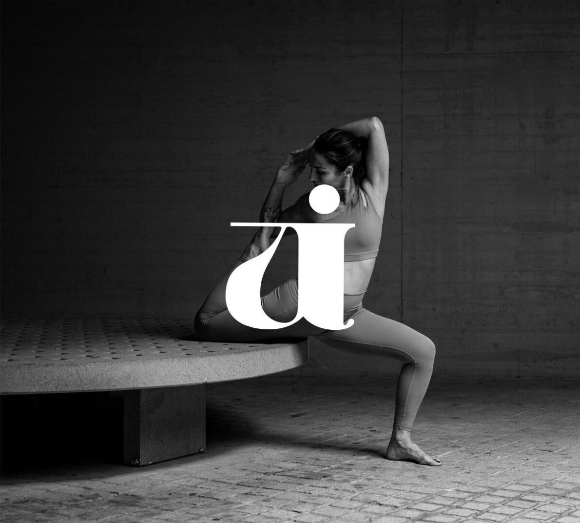
Contrary to our client’s instructions, in order to develop the branding for this yoga centre, we decided not to use the much-used mandala (which makes them all identical to each other), and instead opted to create an isotype based on the fourth chakra, ‘Anahata’.
Starting with an elegant typeface, where the letter ‘a’ allowed us to play with shapes, we were able to achieve the icon we were looking for.
In the end, it was more popular than the original idea and ended up becoming the defining element of the brand, which coexists perfectly with the Yoga Salud typographic logo.
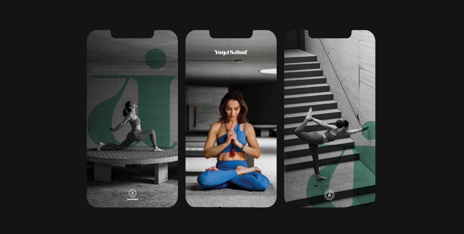
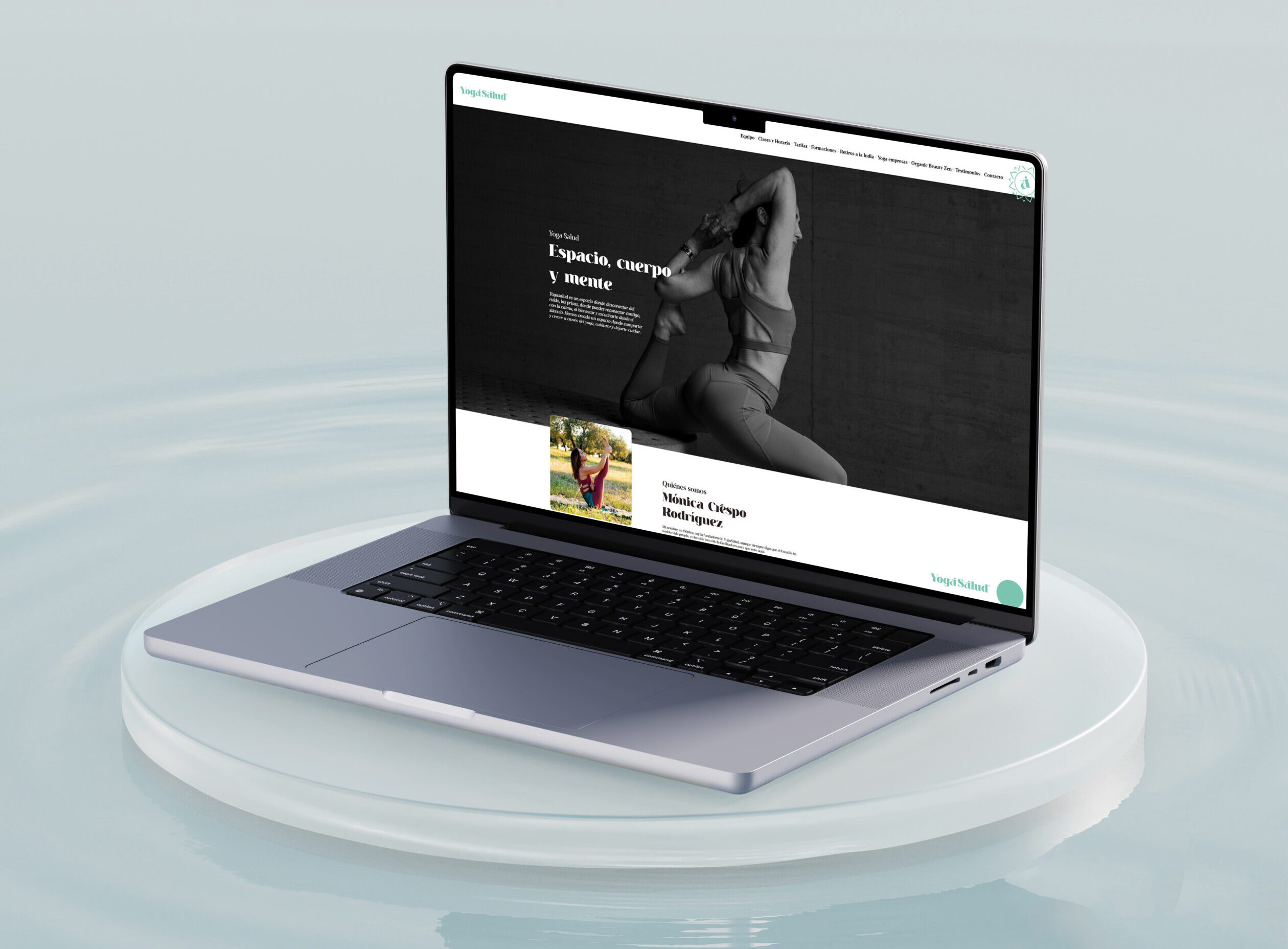
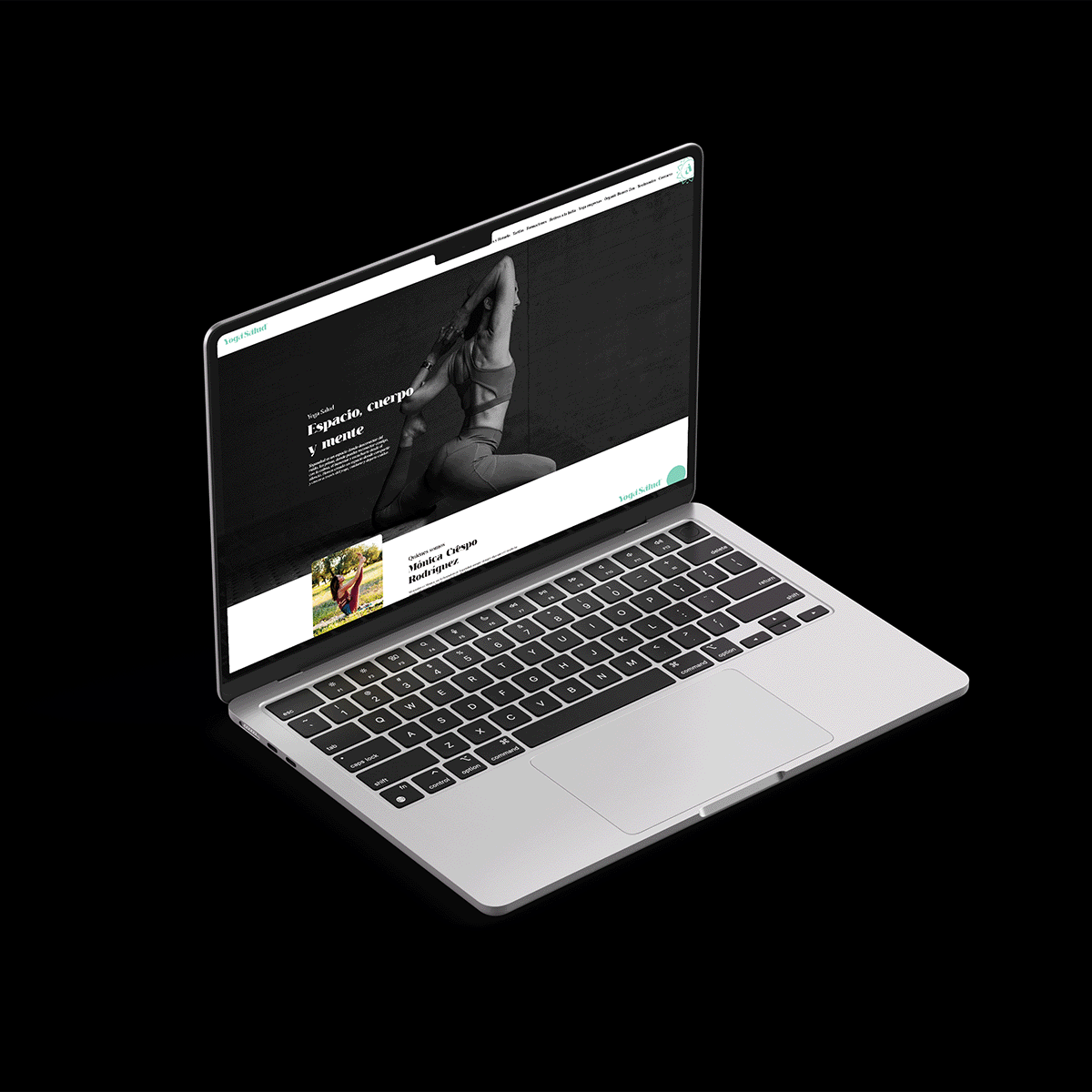
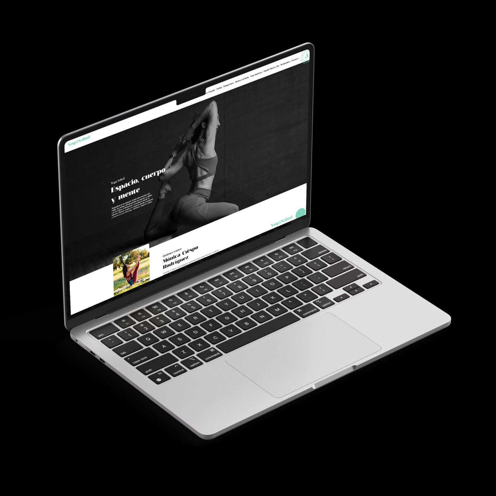
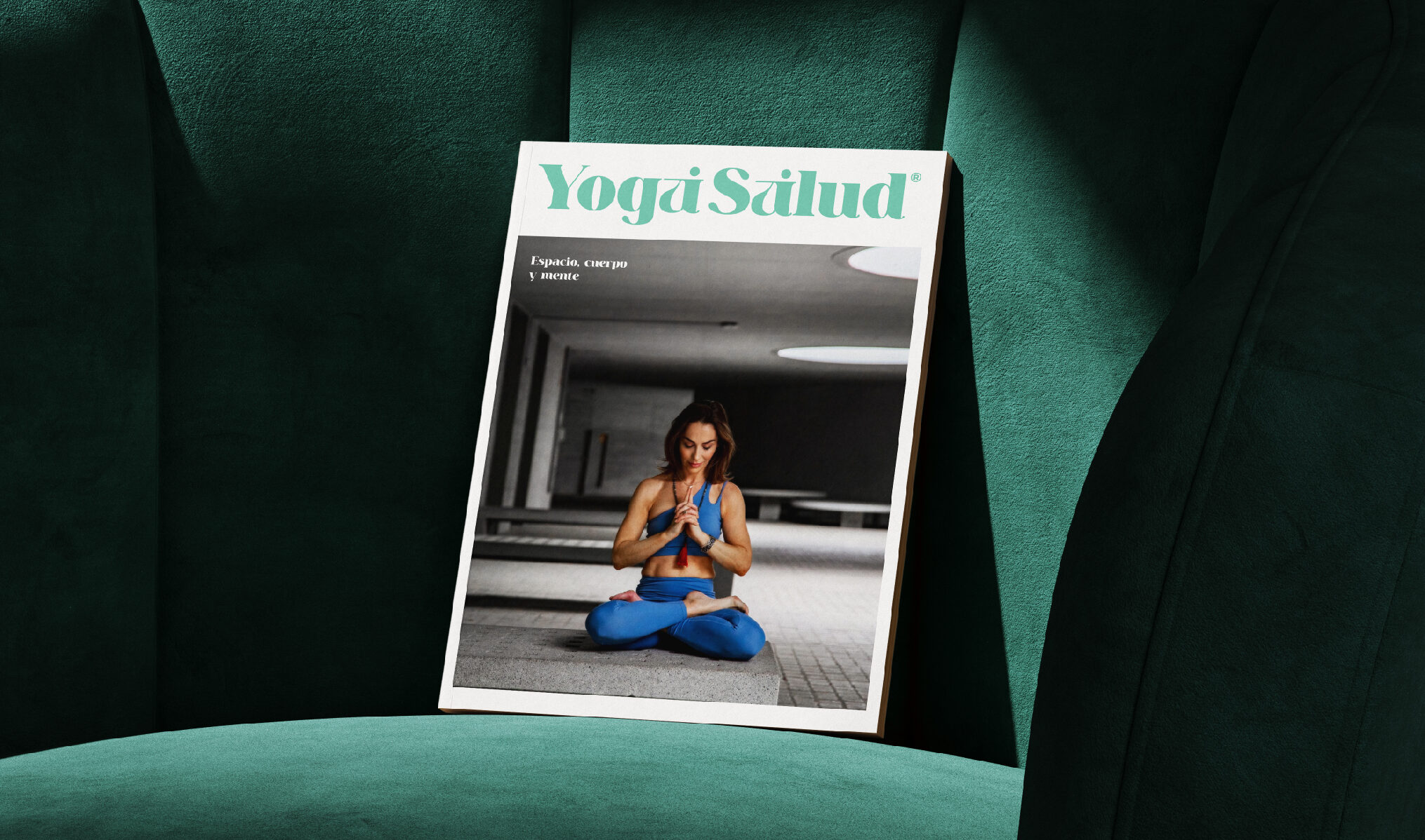
We also worked on the design of the website, where we created a clean and clear design, supported by the striking photographs taken during the process.