Tibbon.
Our most personal project
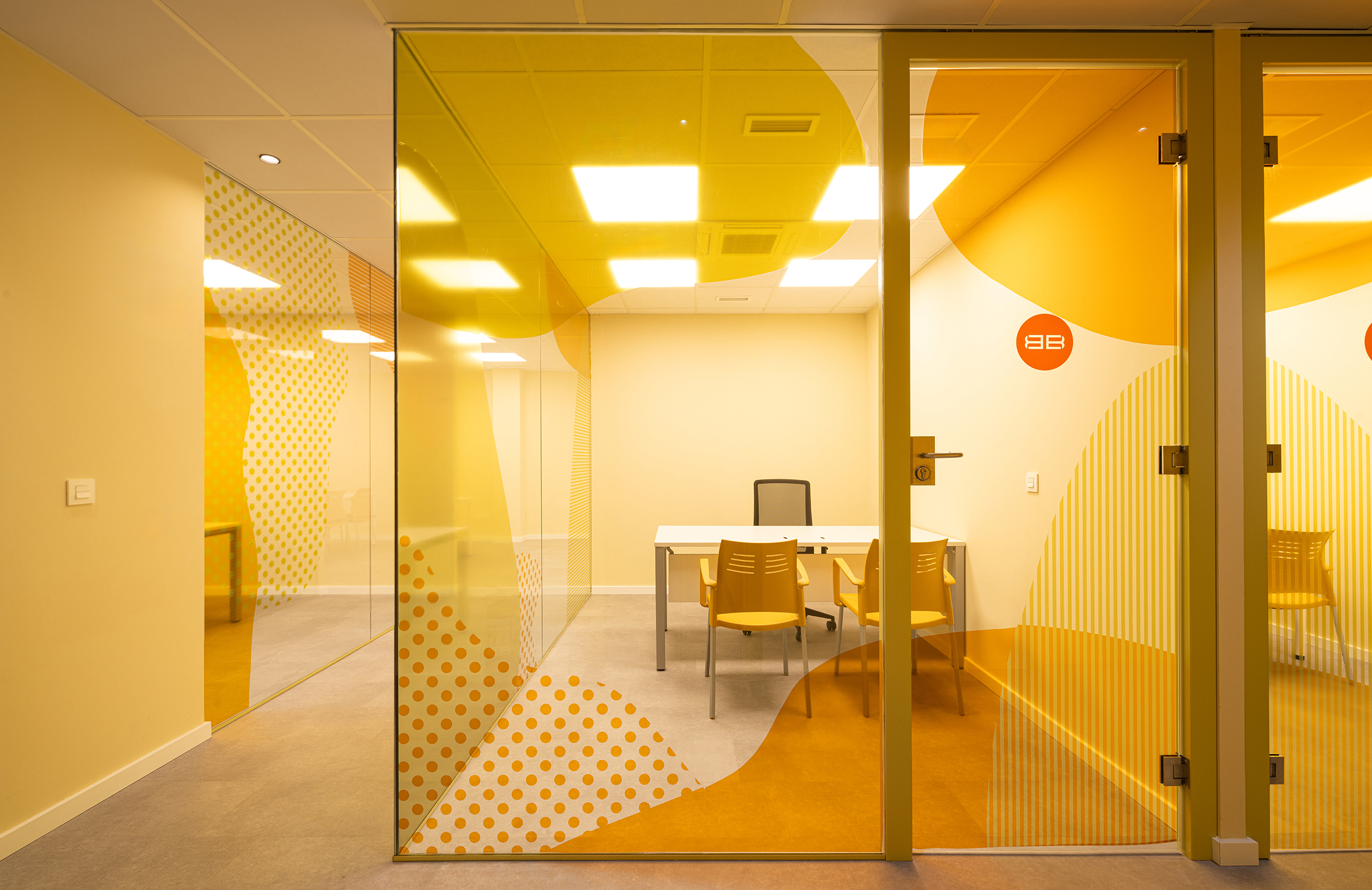
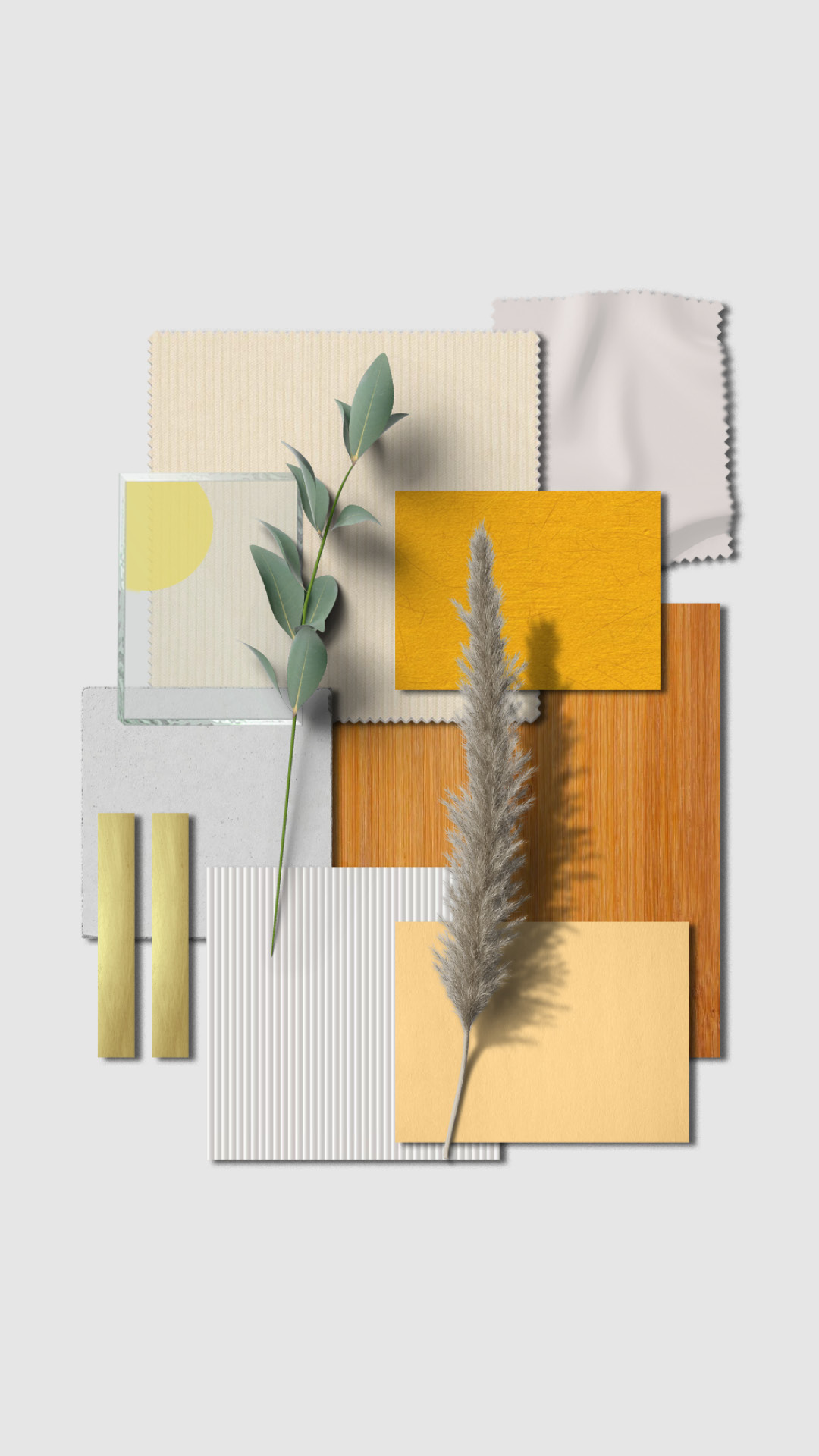
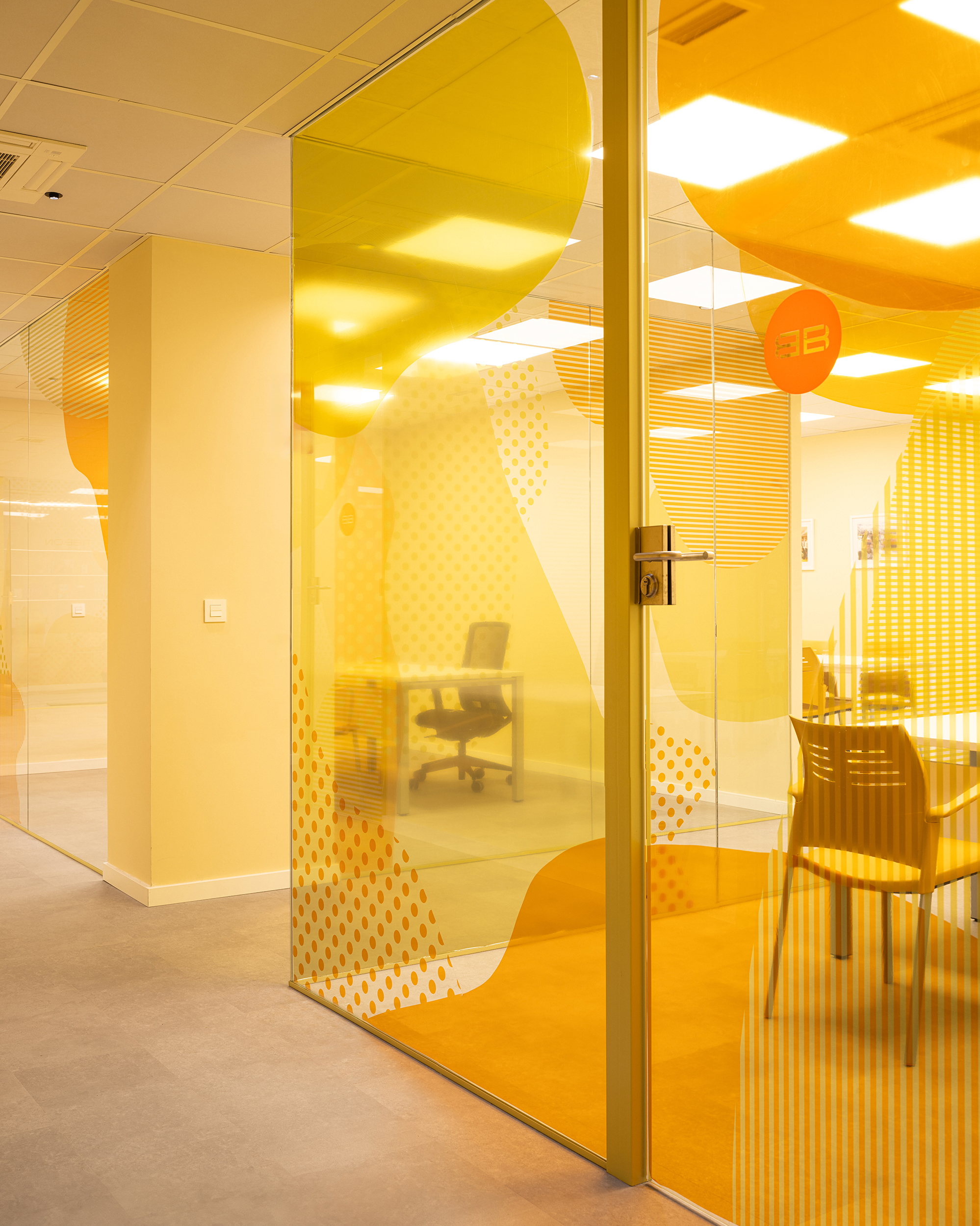
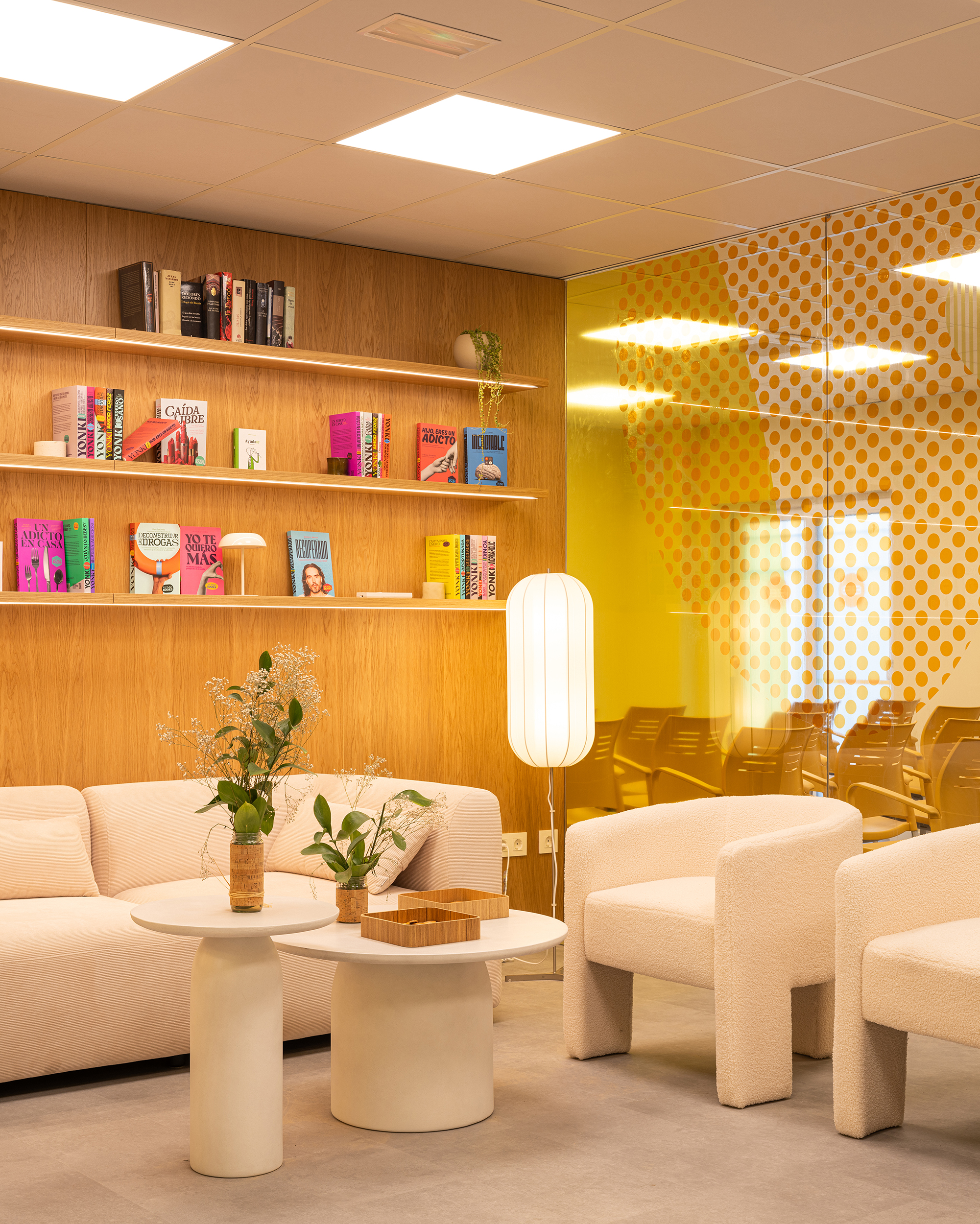
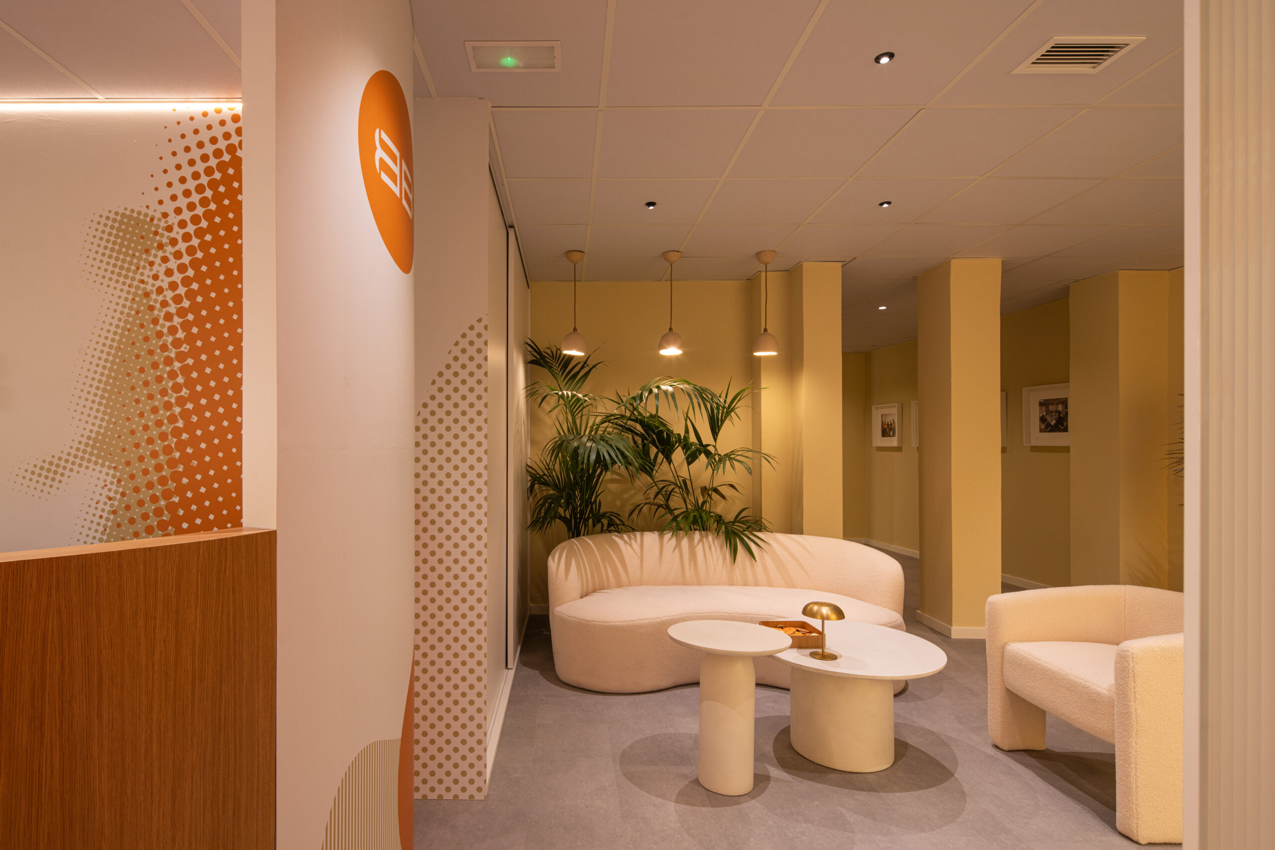
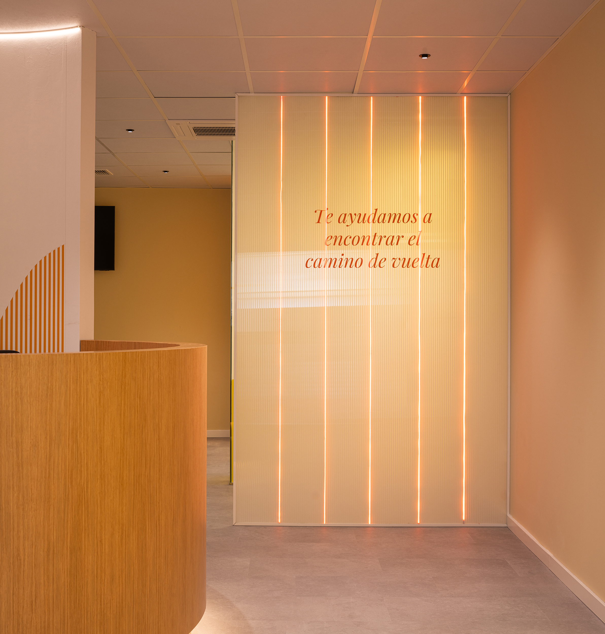
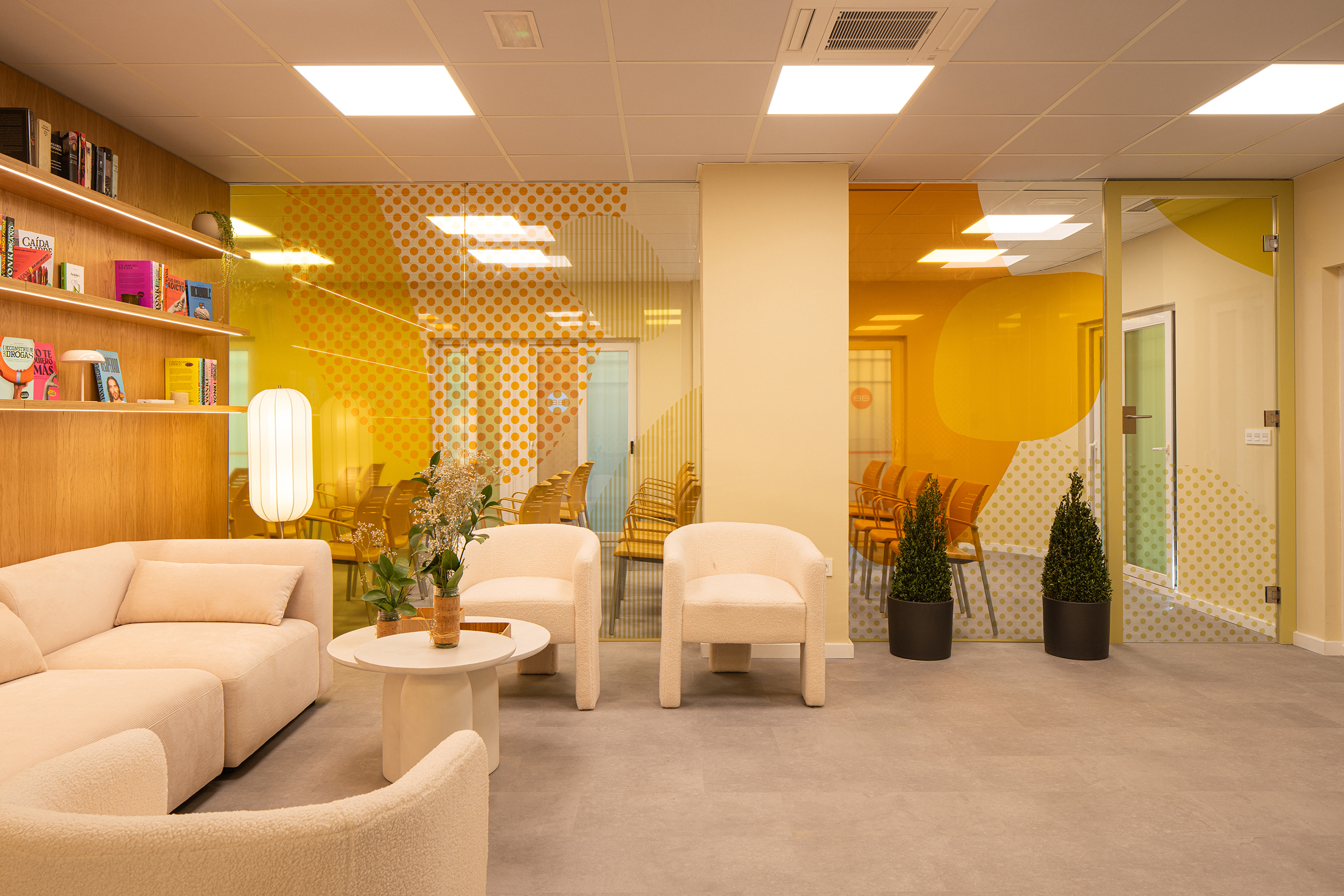
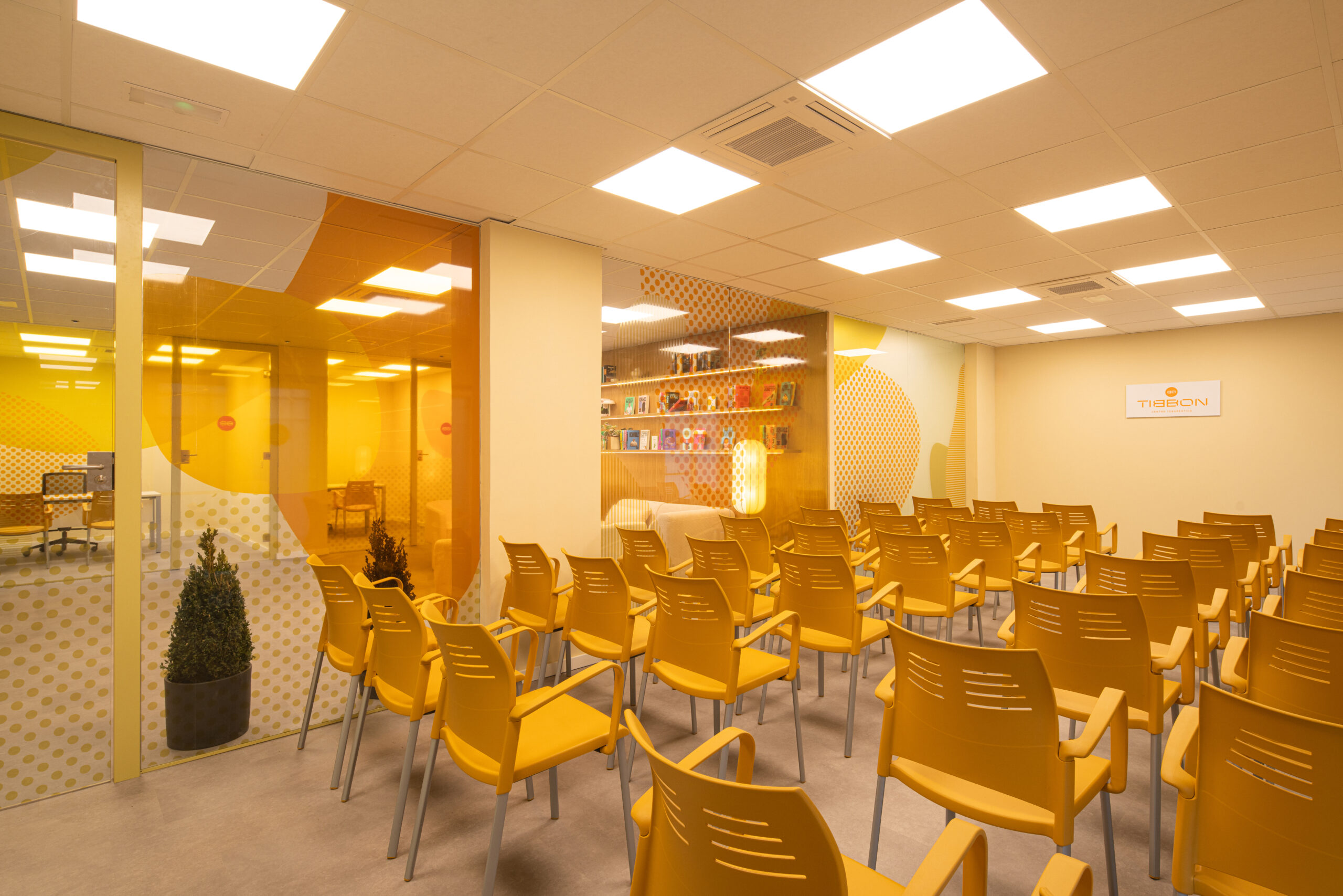
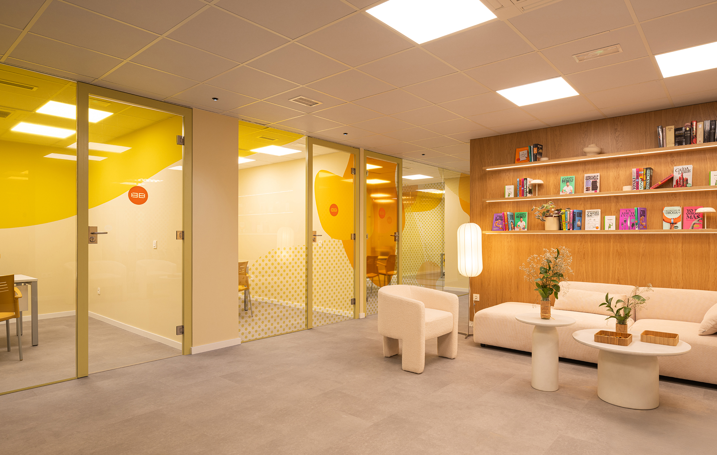
To design Tibbon’s new spaces, we also drew on the brand’s colour palette and reinforced that warmth with the use of natural materials.
Materials such as wood, very cosy lighting and open-plan spaces, where everyone could feel the close presence of the professionals and other patients at all times, applying just the right touch of intimacy in very specific areas.
The entire branding exuded an aura too similar to that of a clinic (a palette of very cold blues), and we were going in a completely opposite direction. We wanted to convey warmth and positivity, to prevent patients from feeling ‘sick’ and instead share a space of well-being surrounded by friends.
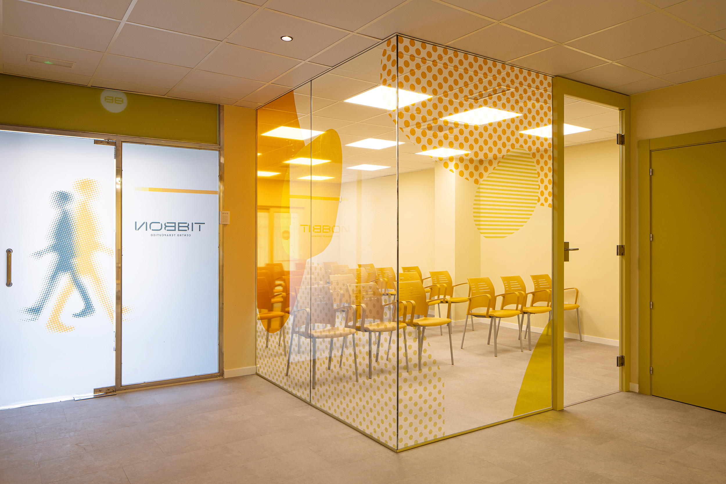
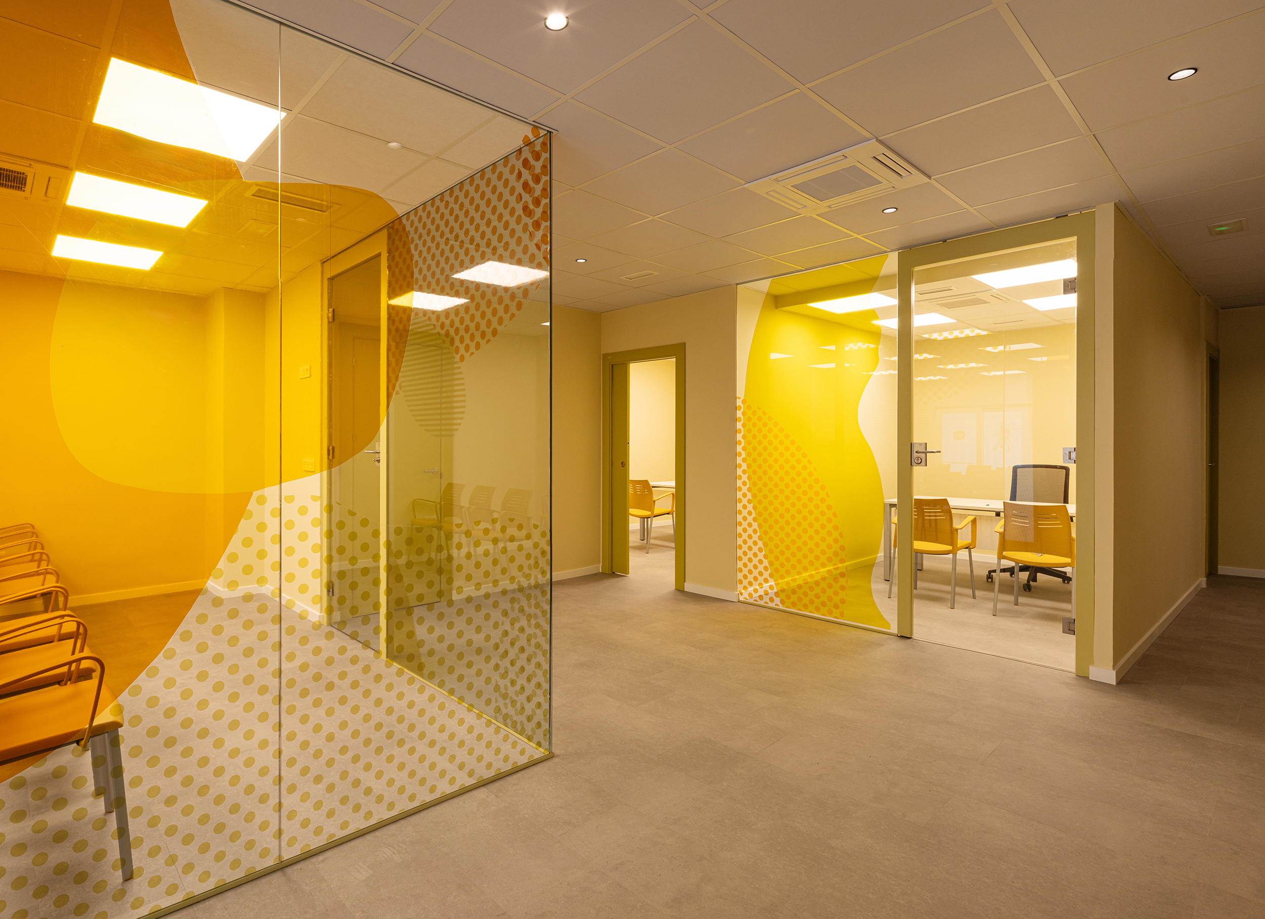
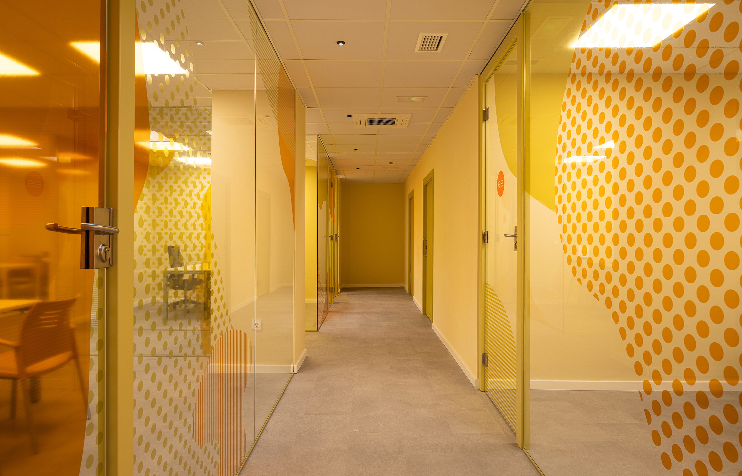
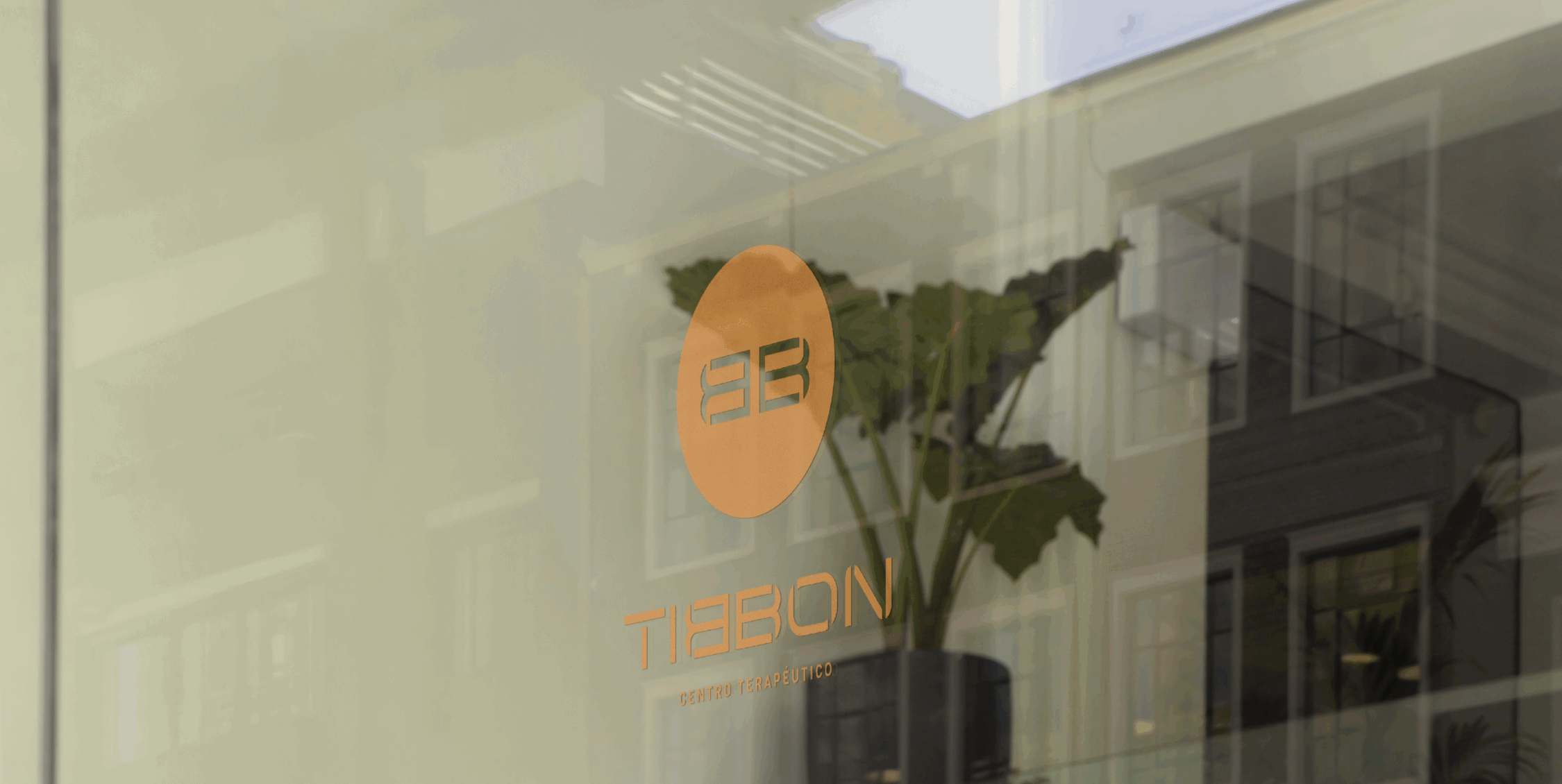
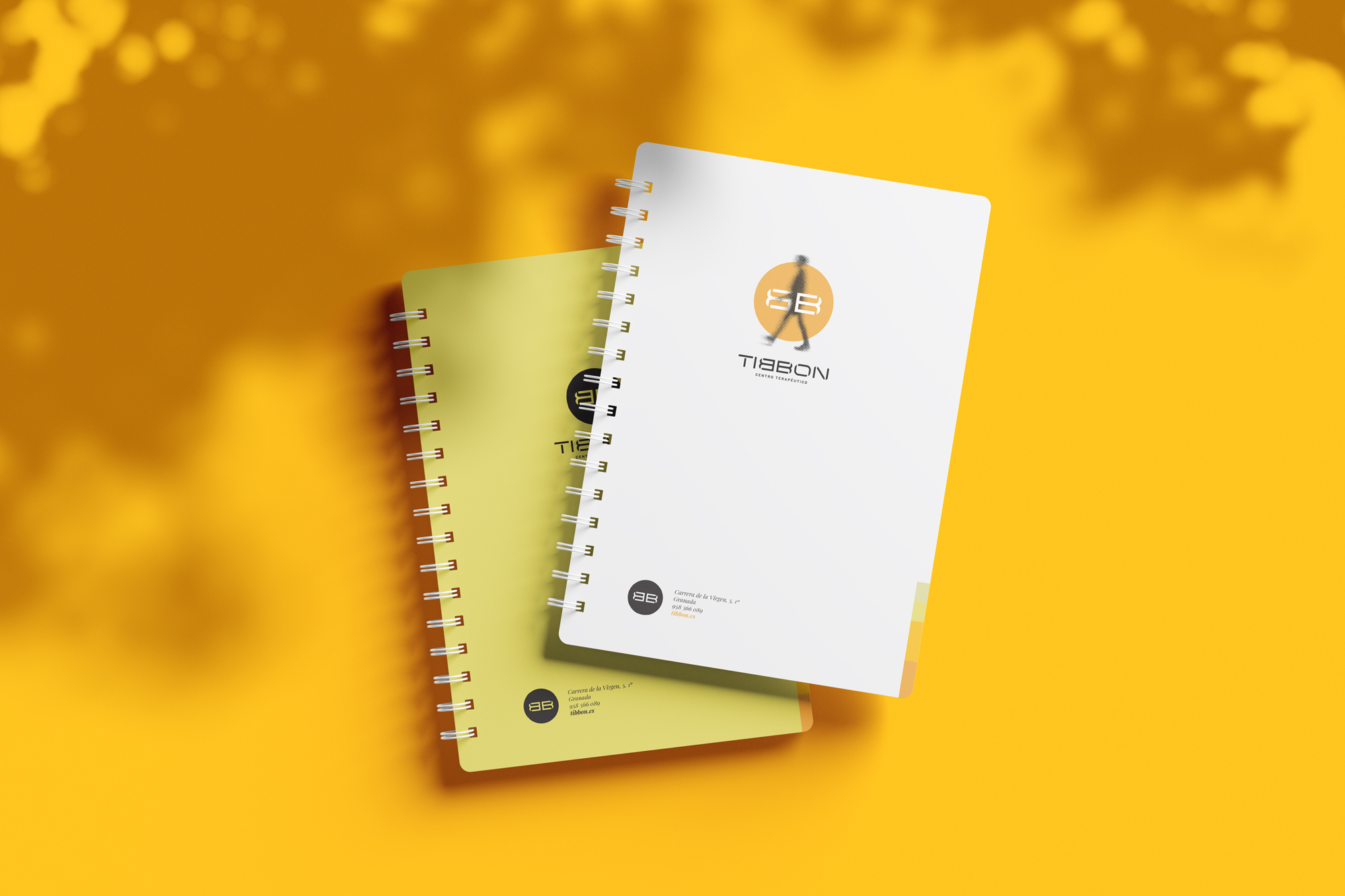
They only asked us to keep their most characteristic feature, the double ‘B’ reflected, one facing the other. Respecting this hallmark, we shaped their image, reinforcing the double ‘B’ to turn it into the brand’s isotype, accompanied by a more geometric typography and reinforced by a palette dominated by oranges, contrasting with pale greens and very light greys.